

When winter is thought of, the first thing that comes to mind is the cold and icy weather. Winter is the coldest season and happens between Autumn and spring. During winter, it is necessary to stay warm and still be in trend. Hence, Winter colors are usually neutral or dark shades that are considered to absorb heat during the cold season.
What are the best colors for winter?
Although, you could rock some bold and bright colors in winter if you don’t overdo it. Some winter colors include;
1. Emerald Green
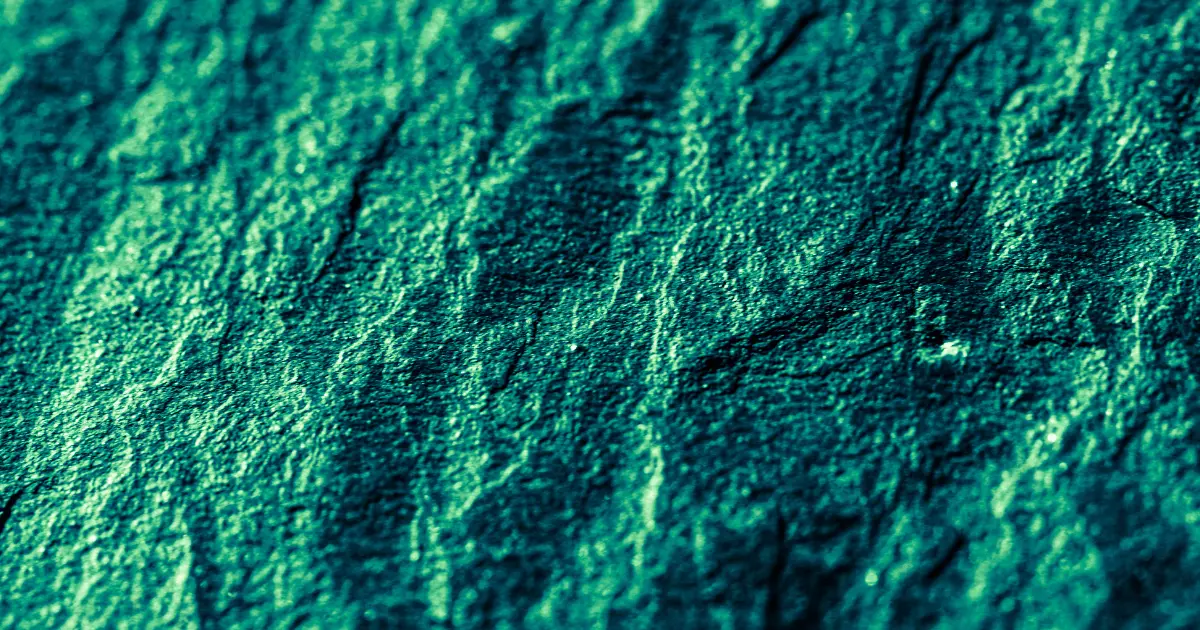
Hex code: #60C878
Emerald Green is bright blue-green color gotten from a blend of blue and yellow, formerly known as Paris green. It is associated with a precious gemstone from a vanadium and chromium molten mixture.
This color symbolizes balance, harmony, wealth, and growth, depending on how you perceive or interpret it. Emerald Green has many suitable purposes, including interior design and fashion.
When used in interior designing, it helps to liven and rejuvenate the space and, when worn as clothing, helps to portray Elegance and finesse. It is an elegant and luxurious green shade that helps you stand out when paired with other colors or rocked alone. However, it is well complemented with neutral colors like Beige.
2. Cobalt blue
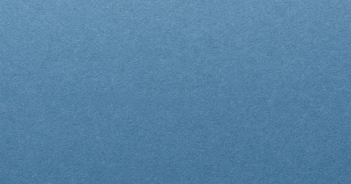
Hex code: #0047AB
Cobalt blue, a result of Cobalt oxide and aluminum, is a bright, detailed shade of blue. According to myths, it was used to paint beards of powerful Kings and Gods in Egypt and was also said to be the skin color of some gods.
The Cobalt blue color has been historically widely used for producing cookware, glassware, and so on. For instance, the Chinese porcelains. It was believed to help with the good flow of energy and wealth.
It is a highly saturated color that depicts richness, stability, and tranquility. It is famous in interior design as the primary focus or accessory. Using this color in the home helps to provide an aura of calmness. It is a common belief that a Cobalt blue stone can heal. Different meanings are perceived for the different ways the Cobalt blue color can be used.
3. White
Hex code: #FFFFFF
White signifies purity, emptiness, and simplicity. It is the lightest color there is, and it consists of all shades on the light spectrum. The Roman and Egyptian gods used the white color, which was also used in temples by priests and priestesses. In the present day, it is still often used for art, history, and cultural purposes, such as wedding ceremonies.
It is an elegant, delicate and graceful color widely used in fashion and interior decorations. In designing, it is used as a background that allows other colors, used as accents, to shine.
When the white color is used for interior designing, the space seems more significant compared to what it was initially, and at the same time, it feels cold and blank. Hence, the context in which this color is used will determine what meaning will be assigned to it.
The color white pairs and blends with almost all the colors you can think of. You can also be used in product branding and marketing.
4. Grey
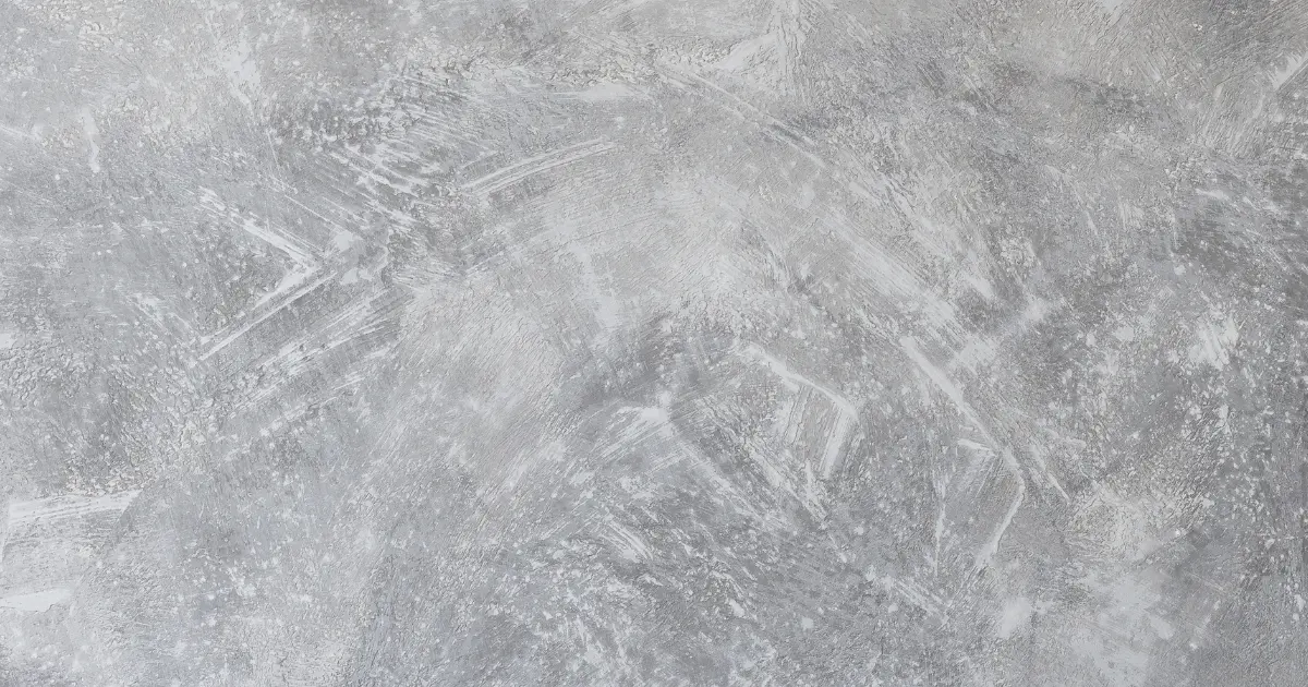
Hex code: #808080
Grey, a symbol of balance, is a neutral color made up of a mix of black and white. It has various shades and can be combined with other colors due to its versatile nature. Grey is a color that doesn’t call attention to itself. When worn as clothing, especially for a formal occasion, it helps you look serious and organized.
Grey is one of the best choices used in interior designing, and it can be used as the focal point or an accessory color. It helps to provide a comfortable, relaxing, and cozy environment. The grey color, when used correctively and effectively, proves, contrary to popular opinion, to be less of a dull color. It adds the element of sophistication to the space it is used for.
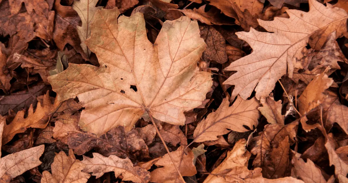
5. Brown
Brown is a less saturated shade obtained from the mixture of either of the two combinations;
Hex code: #964B00
• Orange and black based on the CMYK color model or,
• Red and Green based on the RGB model.
Brown is a natural color abundant in the environment. From the soil to the coffee you drink, to the tree barks to the furniture in your office. It is considered an earthy and warm color and is historically associated with art; it was and is still used for paintings.
Brown, a symbol of healing and strength, is mainly used to complement primary colors because it is considered a blank and dull color. The brown color has a lot of domestic and industrial use; in any case, it provides comfort and reliability. In different parts of the world, brown has different connotative meanings.
6. Burgundy
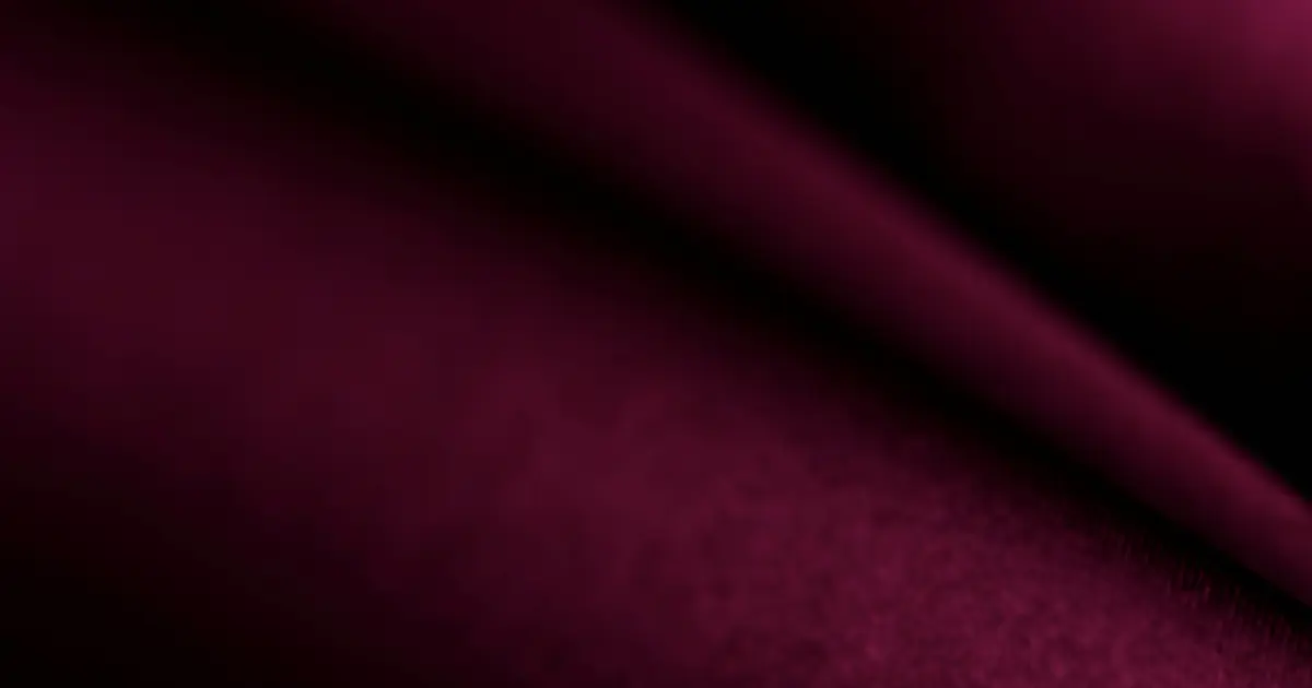
Hex code: #800020
Burgundy’s dark red purplish color was named after the French wine from Burgundy, France. The color is gotten from a combination of Red and Blue, resulting in its dark color.
Being a subset of Red, it also possesses some characteristics of the Red Color, such as Power, passion, and Elegance. Burgundy holds a significant position in the Fashion and Interior designing world.
Burgundy is a stimulating and intense color that grabs attention. When used in interior designing, it is mixed with other colors not to feel overwhelming. There are vivid and dark versions of Burgundy. Burgundy can be paired with vibrant colors like yellow, neutral colors like grey, and complementary or analogous colors on the color wheel.
7. Plum
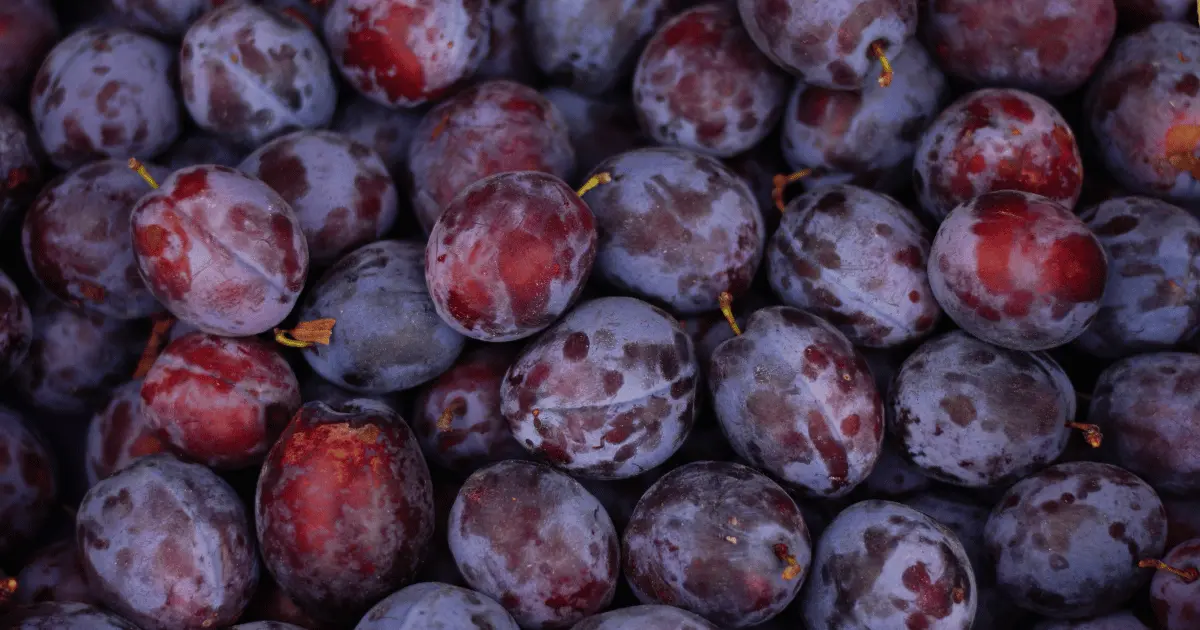
Hex code: #673147
Plum is reddish-purple, soft and colorful, similar to the color of the plum fruit. It has similar characteristics to purple as it symbolizes nobility and luxury. The plum color has many shades ranging from light to dark plum, which is all used in the fashion world. It is a sophisticated color used for wedding ceremonies and formal occasions.
8. Mustard Yellow
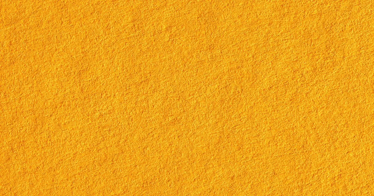
Hex code: #FFDB58
Mustard yellow is a dark yellow color, a symbol of creativity. It is popular in interior decorations and design to give a warm and earthy feel. The color yellow has always been associated with brightness. If you feel the ordinary yellow is too bright, you can never go wrong with the Mustard yellow color; it has a soft feel.
For interior decorations, attractive colors to pair mustard yellow with are grey and white. At the same time, a bold combination would be Mustard yellow with wine, black, Navy, and white in fashion. The results are often outstanding. Likewise, when paired with other colors, it goes for any occasion and appears stylish and decadent.
9. Navy Blue

Hex code: #000080
Navy Blue is a dark shade of blue, which is exceptionally creative and used in many contexts. The color was recorded to be first used by the Royal British Navy in the eighteenth century. It is often considered a neutral color and used as a background to complement other colors.
It is a versatile color paired with other dark colors to retain its dark shade or brighter colors. Some complementary colors of Navy Blue are Orange and Mustard yellow. The Navy Blue is an excellent color that symbolizes Royalty, Masculinity, stability, and power. Apart from interior design, it can be used in the graphic design of products, amongst other things.
10. Beige
Hex code: #F5F5DC
The Beige color, gotten from the mix of brown and white, is often considered a light color. It is a pale brown shade with the earthy feel of brown and the simplicity of white. Beige is a great go-to color for the painting of bedrooms. It is a very organized and welcoming color that matches various colors and purposes.
It is a neutral, primary, relaxing color with many variations and is frequently used as a background color in interior design or graphics design. When used as fabric or clothing, it helps to stand out and, at the same time, provides a feeling of warmth and comfort. It matches any and every skin tone.
11. Lilac
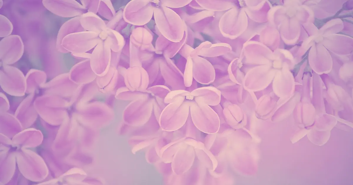
Hex code: #C8A2C8
Lilac is a pale violet tone, a soft shade of purple gotten from a mixture of two primary colors, red and blue. It is a graceful, emotional color and often a symbol of love and affection. It is delicate and versatile, providing a sense of fulfillment in any context it is applied.
Many colors pair fantastically with Lilac, and a soft shade paired with solid colors like; Orange, Green, and Yellow. Like the purple color, Lilac is associated with power and wealth, and it also gives a feeling of comfort and pleasure.
Lilac is commonly found in nature, such as in flowers and birds, and has historical and cultural meanings. It is considered a spiritual color, free-spirited, and of aesthetic value.
12. Cream

Hex code: #FFFDDO
Cream is another light color you can wear during winter; many people associate it with summer, but it is a typical winter color. If you don’t feel like going along with white, cream is the best substitute for white because it is a popular shade of white. It is a calm and relaxing color that can be paired with darker shades for contrast.
The cream color is a neutral and soft hue of white gotten from a mixture of yellow and white. It is used in paintings, art, clothing, design, sports, and many more. It symbolizes simplicity and the meaning and feeling you get from the color depending on what context and how you use it.
13. Crimson
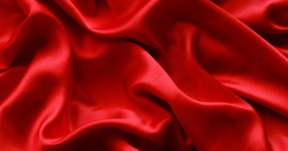
Hex code: #DC143C
“Crimson” is coined from the Arabic word, Qermez, which means Red. It is a regal, bold, luscious, and bright red color found on the color wheel between Rose and Red, gotten from a mixture of Red and Blue and somehow tilting towards purple. It is tagged the color for love and affection.
In Queen Elizabeth’s era, only people of timbre and Calibre were allowed to wear Crimson. The color is vibrant and versatile; hence, it suits any purpose.
Crimson pairs beautifully with any color you can think of, but in cases where you need more clarification about what color of cloth to pair it with, your best option is to go with neutral colors. When used in interior designing, it can be used as the primary color or as a complement. It has a high transformative power and always gives off an eclectic vibe.
14. Fuschia
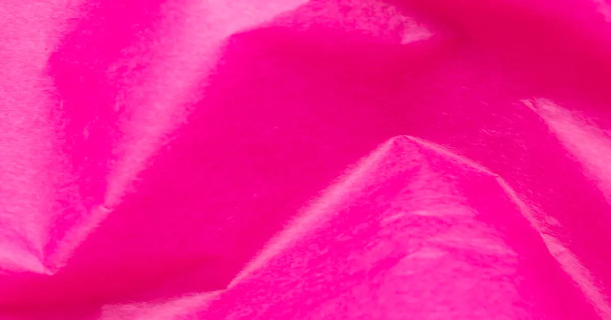
Hex code: #FF00FF
Fuschia is an energizing, feminine, and bold color often thought of as a member of the Pink family. There are several ways to describe this unique color, as it blends two beautiful colors. It is found between purple and pink on the color wheel but looks more purple than pink. It is named after a flower known as the Fuschia flower.
Although it is a fun color and considered feminine, it gives a more confident feel than other shades of pink. Apart from interior designing, Fuschia is commonly used in the women’s clothing line and fashion world. Fuschia is a very bright, intimidating color; hence, it is considered best to pair with darker shades like black to make it pop.
15. Forest Green
Hex code: #228B22
When Forest Green is thought of, the first picture created in one’s mind is of the forest’s shrubs, plants, and trees. It is a dark shade of Green and has several cultural and environmental associations. It is also related to the military and sports.
Red is complementary to Forest Green on the color spectrum; hence, it is used with it for various designing, such as Christmas-themed decorations. Forest Green is a rich, deep hue of Green that symbolizes growth, nature, and balance. It has become a key color in the interior design of any place in the home.
Adding a sprinkle of Green in your home, like a few potted plants or accessories, helps to liven and add sophistication to your space and provides a sense of relaxation and comfort.
16. Brick Red
Hex code: #AA4A44
Brick Red is a brownish-red color, a symbol of passion and great energy. Its principal use is the decoration of homes, either the exterior or interior of the house, along with other colors that serve as accents. The color found complementary to Brick Red on the color wheel is sage Green.
If you are not one to like the brightness of the red color, brick red is the best choice for you as it has a dark hue. It is an earthy and warm color used in the Fashion industry to produce a simple and stylish look. Being a darker shade of Red, it is best worn in winter and looks great in any clothing, from the coat to scarves to pants, trousers, and dresses.
17. Olive Green
Hex code: #808000
The dark yellowish-green olive color is similar to the color of the olive fruit, and it sits between yellow and green on the color spectrum.
This shade of Green was used as perfect camouflage in the US military, and it allowed the soldiers to blend in with the environment when needed. It is considered a neutral color and used in the Fashion industry as it helps to accentuate various skin tones.
Olive Green, just like the Green color, symbolizes life and nature; it has its symbolization which includes harmony and sophistication.
18. Violet

Hex code: #8F00FF
In 1672, Violet, a complementary color made from the mixture of blue and red, was found at the end of the color spectrum when divided by Sir Isaac Newton. It is named after a flower, has a very short wavelength, and is one of the colors of the rainbow. It is also considered a royal and regal color, like purple.
The violet color is one of the oldest in arts, history, and culture. The yellow color is found complementary to it in the color will; it’s an excellent choice; however, other colors go well with Violet. It is an energetic, inspiring, and creative color.
When worn as clothing or accessories, it shows nobility, and when used in designing the interior of a room or other spaces, it helps in relaxation and meditation.
19. Teal

Hex code: #008080
The teal color is a light greenish-blue color that got its name from a freshwater duck known as the Eurasian Teal, which has the same color. Teal is a tertiary color with the characteristics of both Blue and Green, combining Green’s revitalizing ability and the blue color’s integrity.
There are numerous shades of Teal, all peculiar for their luxurious nature and richness in beauty. It is frequently used in the market industry and is discovered to be the color of many countries’ flags. Across different cultures, the Teal color has different uses and meanings.
The Teal color is intense and often paired with dark or neutral colors to tone it down. On the color wheel, the color pink is complementary to Teal; hence, an excellent color to pair it with. Other colors like pink, cream, silver, and white can also be used. It is a color that portrays serenity and is believed to have healing effects.
20. Scarlet
Hex code: #FF2400
Scarlet is a bright red color with a certain percentage of orange; it is said to be found between red and orange on the color wheel. Being a member of the Red family, it is a color that portrays fierceness, passion, and courage.
It is a color that showed nobility and was also historically said to be the color of the British Army uniform. In the past and present, Roman Catholic priests wore Scarlet robes to show devotion and sacrifice. This color has been found in nature, science, and culture till now. The scarlet color has revolutionized and is now used in the Fashion and design industry.
When used for interior decoration, the scarlet color is alluring and energizing. It can be used either as the primary color or as a complement to the main color. It is an intense color; hence when paired with bright color, it might give effects contradictory to what was intended.