If you are looking for a bright color that effortlessly reflects beauty, just as it sounds, you should go for the orange color. This color works wonders in stimulating our minds to register information quickly, especially when viewed in a graphic design. It makes paintings pop and projects a message of a bubbly aura.
Do you wish to understand this color better and also how to combine the necessary colors to create a perfect shade of Orange for your use? If your answer is yes, absorb all the comprehensive guidelines in this article as regards making the color orange.
Origin of The Orange Colour

Orange was previously recognized as yellow-red in different parts of the world, except in Europe, which was known as Orange. Before this color was recognized by its name, it was used as a mineral powder to create artwork, including paintings. The major downside to the use of this power was the toxicity of this compound.
Another toxic material used to make a pigment similar to the orange color was produced by the Romans using Orpiment. It was used to make high-quality paintings but was detrimental to the health of the producers and users.
The name ‘orange’ got popular as Orange fruit became common. As time went on, famous artists infused different shades of Orange in their paintings, thereby increasing the popularity of this color.
A country that has this color as its national color and part of its flag is the Netherlands. In Asia, the color orange represents spirituality because Buddhists wear it for religious activities. In prison facilities, prisoners are made to wear Orange to be visible wherever they go within the facility.
In America, Orange is related to Halloween, as evidenced by the widespread use of orange pumpkins to make Halloween decorations.
What Two Colours Make Orange?

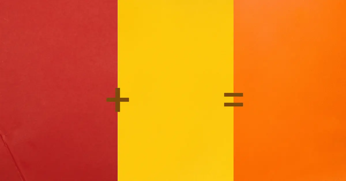
Orange is a secondary color (secondary colors are made by combining two primary colors). To create Orange, combine yellow and red in equal amounts to produce a perfect shade of Orange.
These colors can be incorporated in different ratios to produce shades of Orange. For instance, adding more yellow to the palette would lighten the hue, while adding more red would darken the hue of the orange color.
You should also take into consideration the color bias of making Orange. Select warm yellow and red to create a vibrant orange color. Using cool yellow and red would result in a relatively dull orange.
What Does The Colour Orange Represent?
Orange color has a unique meaning to everyone, and it stimulates positive feelings within us and evokes happiness or cheerfulness when viewed in art or logos. The color orange triggers excitement, and it can increase our energy levels, according to a study done in 2018.
Citrus fruits have the quality color orange in them. That is why when we hear the word Orange, we think of something attractive and sweet to taste. For example, Fanta, a soda product, uses a lot of Oranges for publicity to convey that its content is delicious and refreshing.
Orange is a playful and relatable color that could be used in adverts depicting pocket-friendly sales. The color of leaves during autumn has a beautiful shade of Orange and sets the atmosphere for Halloween.
People who love the orange color are optimistic and are excellent problem solvers. They are friendly and outgoing and do not mind a little showoff.
Deeper shades of Orange usually carry negative interpretations and are seen as dark, gloomy, self-absorbed, aggressive, and proud.
How to Use The Orange Colour
I suggest you use Orange mostly when you desire to capture your audience’s attention, especially as a graphic designer or artist. Feel free to use this bright, bubbly color if you intend to offer massive discounts or promos on your products or services.
If you are a fashionista and wish to stand out among the crowd, use the opportunity to partner with autumn by rocking a bright orange gown and black boots with silver accessories to match.
An excellent to create a calming effect in your home is by applying the orange color to your interior. For your room, paint your walls a beautiful shade of Orange and have your beddings white or lighter shades of Orange. Including furniture of beige color, and paint your wardrobes a deep shade of Orange.
What Colours Go With Orange?
Several colors pair perfectly with Orange, especially when used in interior designs. A good example is orange and mustard yellow. In some cases, Orange can take some of the show; you can apply just a small amount to create that good effect and add beauty to your interior.
Other colors you can combine well with Orange include mint green, red, black, navy blue and muted Orange, white, and a splash of Orange. You can explore several orange color palettes to find the perfect combo that suits your personality.
How to Make Dark Orange

The process of making dark Orange does not have many technicalities Involved. It is made by combining ultramarine blue with your pure orange color. You can also use the option of adding black to Orange.
However, it would be best to be cautious when using either blue or black. Adding too much black or blue would cause drastic changes to your color, and you might end up with a brown or black color.
The logic behind using blue as a darkening agent in Orange is that it complements this bright color on the color wheel. Combining these two do well in creating a uniform, dull color.
How to Make Pastel Orange

If you wish to create a very light shade of orange or Pastel orange, you can add a very small amount of white. Colors have a way of making a huge difference, even in minute quantities.

