
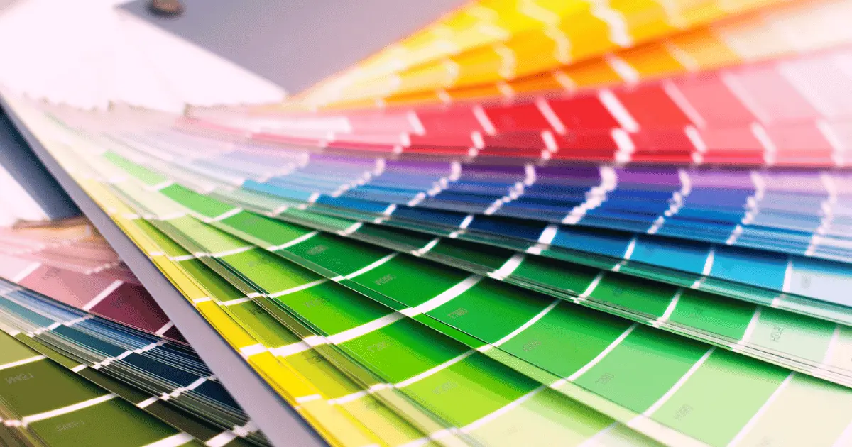
Colors are a huge part of our lives. Everything around us is characterized by shape or form and colors. Imagine a world without colors! Colors make the world around us look beautiful and accommodating.
Psychologically, colors affect how we feel and our thought processes. Some colors stimulate intense emotions like love, romance, and anger; some can unconsciously make you feel an incomparable sense of peace.
One of the best ways to channel the positive emotions embedded in colors is to combine them correctly. It would not harm to go on a little color adventure.
2 Colors That Look Great Together
Combining colors would waste no time unleashing your inner creativity, and you would have a wide range of options. With unique color combinations, your wardrobe would look more appealing, and your interiors would also look accommodating. Also, as a graphic designer, your portfolio would be filled with professional and exciting designs that do well in capturing attention.
It is time to broaden your horizon and shift from boring color combos to this list of 50 Sets of elegant colors that pair beautifully well with each other.
1. Lime Green (#32CD32) And Electric Blue (#7DF9FF)
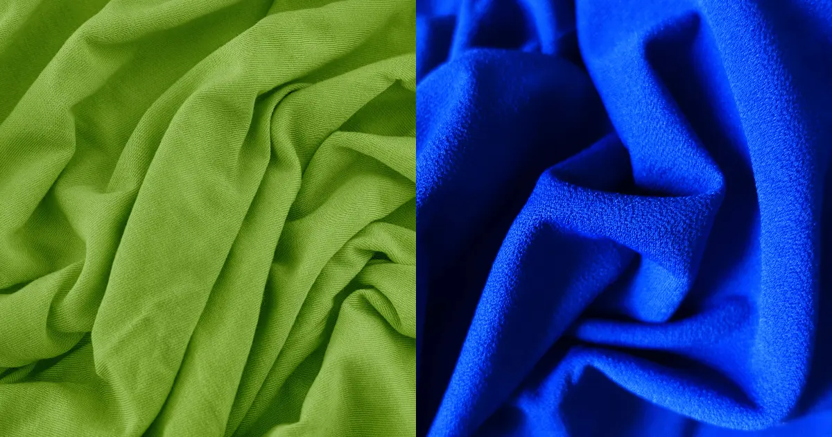
This palette involves infusing two bright colors into your style or designs. Lime Green and electric blue are highly energetic colors and inspire one of the highest levels of creativity. The presence of electric blue gives a unique spark to your designs and effortlessly grabs a huge audience’s attention.
This combo is quite popular in innovative brands and men’s fashion due to the masculine nature of blue. These colors are a favorite to many.
2. Lavender (#E6E6FA) And Teal (#008080)
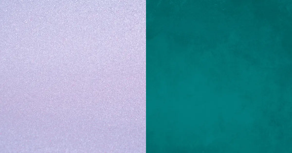
You can pair these two rejuvenating colors to give a calming effect. Lavender is a gentle shade of purple, stimulating a rare feeling of freedom and tranquility. Teal combines with lavender to elicit a sense of balance and clarity. It makes your design and fashion statement smart and relatable.
3. Hot Pink (#FF69B4) And Cyan (#00FFFF)
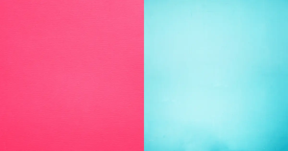
This color combination is as hot as it sounds. If you are very expressive, this combo is ideal for you—the process of making your content pop on any design. Hor pink is highly related to feminity and intense romance; combining it with cyan makes your outfit or design stand out.
You could make cyan as your background and pink for your text and call to action. You could rock a hot pink skirt and cyan blouse with simple cyan heels for your wardrobe.
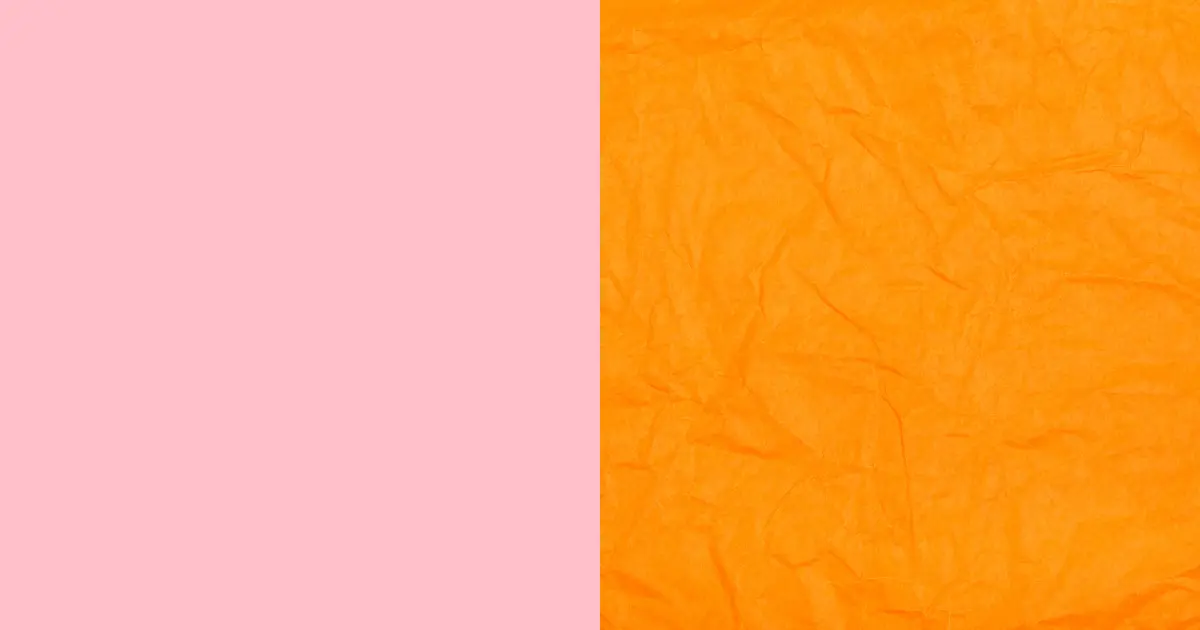
4. Peach (#FFE5B4) And Burnt Orange (#CC5500)
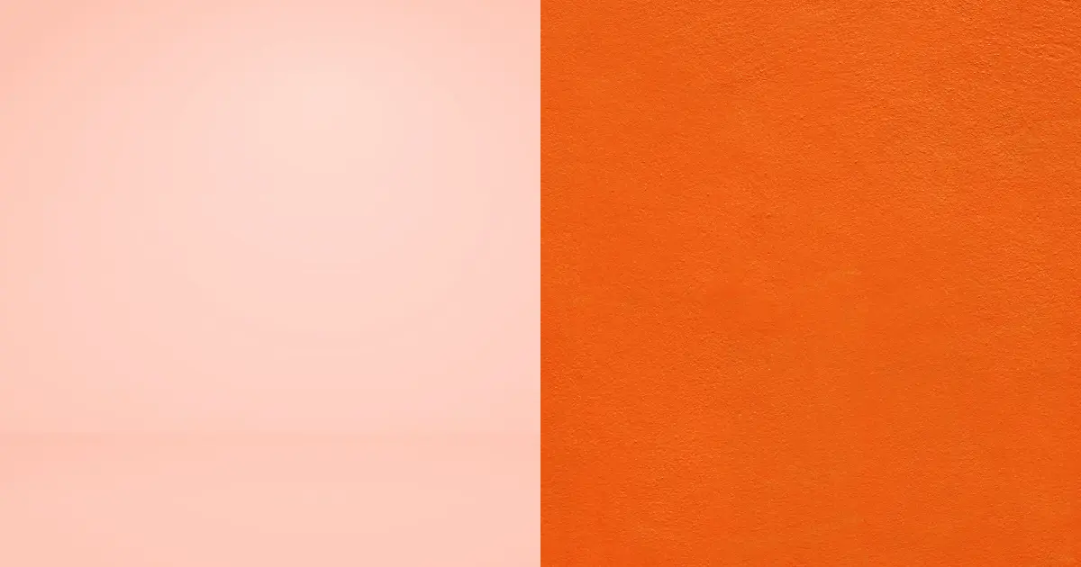
Burnt orange is a deeper shade of orange, which symbolizes energy and warmth, while peach is soft and comforting but at the same time warm. These two colors combine to produce the most elegant designs you can imagine.
To make your home inviting, you could have your walls painted a rich hue of burnt orange and have a beautiful arrangement of peach-colored accents here and there. For branding, it is ideal for products related to skincare and beauty.
5. Light Blue (#ADD8E6) And Dark Blue (#00008B)

One look at this palette will tell you how beautiful monochromatic color combinations can be. These two colors are cool and inspire an extremely calm feeling. You can modify these colors in your outfit to create an ombre effect for a seemingly perfect transition. This color combo is suitable for designing the interiors of your office.
6. Forest Green (#228B22) And Moss Green (#8A9A5B)
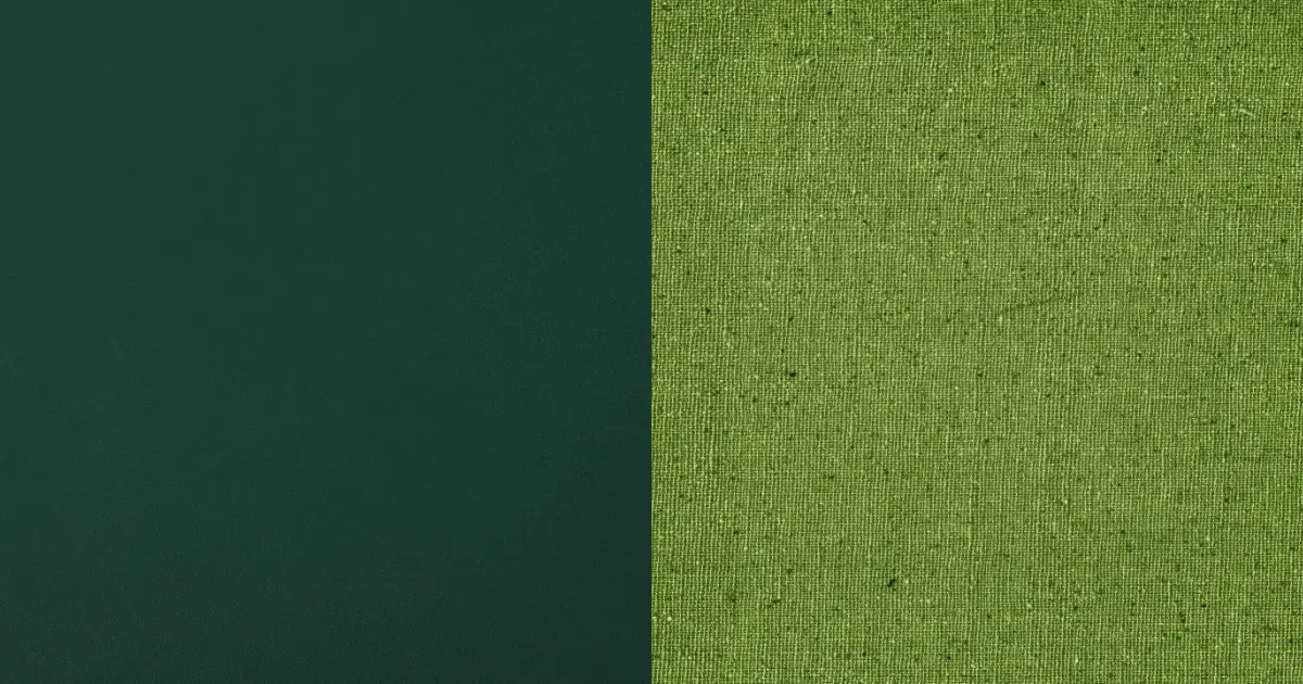
Green is strongly associated with our natural environment; the trees, leaves, fresh morning dew on plants, etc. Combining these two colors would define you as adventurous and daring. This palette symbolizes growth, nobility, and freshness.It is perfect for designing products relevant to healthcare or pharmaceutical products. It is also useful for nature preservation campaigns.
7. Royal Blue (#4169E1) And Pale Yellow (#FFFFA7)

The best way to make pale yellow not so boring is to combine it with the rich shade of royal blue. Everything blue is related to is beautiful, vast, and energetic such as the sky and the ocean. This combo expresses luxury and elegance and is useful for making business logos and branding confectioneries.
Another good thing about this combo is how it suits almost all skin tones. Match royal blue pants with a pale yellow top or a pale yellow jumpsuit with a royal blue jacket draped stylishly over it. These colors can also be infused into your home for perfect interior decor.
8. Sunset Yellow (#FFC922) And Pastel Blue (#AEC6CF)

For a unique, exhilarating experience with colors, try combining sunset yellow with a cool shade of pastel blue. Pastel blue’s soft and delicate hue balances the intense emotions associated with sunset yellow. This palette is suitable for designing e-commerce platforms and restaurants.
9. Black (#000000) And Orange (#FFA500
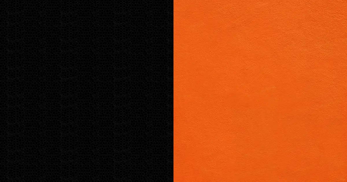
Black is a very bold color and combining it with orange makes the result quite friendly and approachable. This palette creates designs that depict power and sophistication. An outfit with this color combination gives you the appearance of someone strong-willed and in control.
This palette is perfect for designing business logos, especially for interior decor experts to define class and luxury. For a perfect outfit, match black pants with an orange shirt and black shoes to work.
10. Maroon (#800000) And Peach (#FFE5B4)

Maroon is a deep shade of red, often confused with burgundy. Burgundy is a mixture of red and purple, while maroon is a mixture of red and brown. This color works brilliantly in cooling the intensity of bright red to give a more calming effect, especially when combined with other colors. It is associated with respect and thoughtfulness.
Peach is a comforting color from an orange, yellow, and white mixture. Combining this color with maroon produces an amazing result.
This color combo is ideal in school settings as uniforms with maroon for the skirt or pants and peach as the blouse. These colors promote a sense of creativity and add warmth to your space. It is also very applicable in restaurants with maroon as the background color to stimulate customers’ taste buds.
11. Beige (#F5F5DC) And Grey (#808080)

The union of these relaxing colors is perfect for those who love to keep things simple and elegant simultaneously. They are both neutral colors that are flexible and suitable for various applications.
It gives your design or home a sense of organization and serenity. Depending on the shade of beige and grey you are combining, you can create a sophisticated interior design in your living room, especially. It gives your home a smart and spacious look.
12. Indigo (#4B0082) And Lavender (#E6E6FA)
When combined, these practical colors give one a deeper awareness and intuition. These colors are suitable for making backgrounds in photography to make photos pop better.
You can apply these colors in your bedroom for a soothing effect. Make your bedsheets a beautiful shade of lavender and your pillows Indigo. You could make your wardrobe a rich shade of lavender with indigo handles, giving your room a monochromatic effect.
13. Tomato Red (#FF6347) And Green (#00FF00)

These complementary colors pair perfectly with each other and have vast applications. For your web designs, you could use red as a button to warn users before clicking, while green gives users a positive feeling about the next action.
This palette also works well for designing your interiors for superb elegance. Paint your walls a deep shade of green for sophistication and an aura of mystery, then add a green couch to perfect that effect.
14. Bistre Brown (#967117) and Olive Green (#808000)
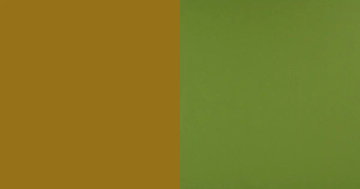
These colors mimic the natural environment around us; the trees and rich soil. Combining bistre Brown and olive green makes your interior very cozy. You can paint your walls olive green or make it the background color and fix accents of brown for your cushion and wall.
15. Blue (#0000FF) And Peach (#FFE5B4)

Do you wish to design something soft yet exhilarating? Try out the cute palette consisting of the energy and coolness of blue plus the calmness of peach. These colors are perfect for wedding decorations to inspire a fresh feeling of love and romance.
You can also create a perfect outfit by wearing a blue gown and enhancing your look with peach shoes, a bag, and accessories.
16. Baby Blue (#88D1F1) And White (#FFFFFF)

Baby Blue is highly associated with tranquility and masculinity; little wonder it is mostly used for baby boys, especially during gender reveals. Adding white gives the color a sense of purity, innocence, and clarity. This combo is also great for bathroom decors, and you could have white and blue petals-inspired tiles and white walls.
Blue and white are also widely used in the health industry to depict good health and maintain a healthy environment. Toothpaste companies usually use this color scheme in designing their products or for branding.
17. Pink (#FFC0CB) And Green (#00FF00)
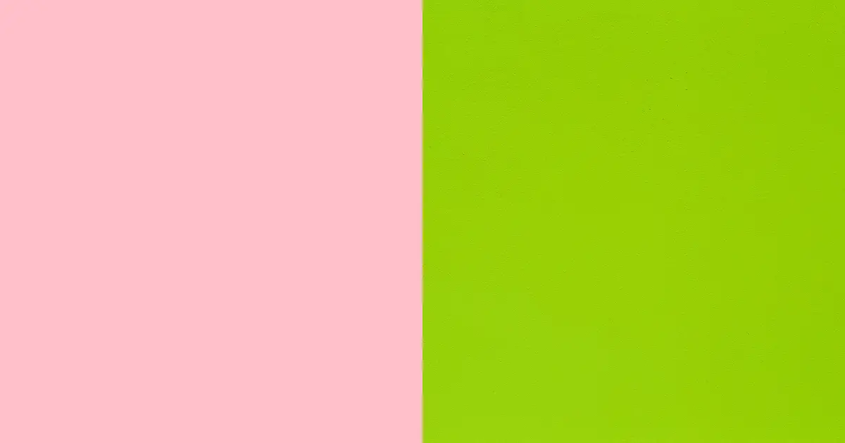
This color scheme is soothing and tranquil. The combination of nature and the softness of pink makes this palette worth every hype. You can incorporate these colors in your interiors, making pink the background and adding some green plants in flower pots as part of the setting.
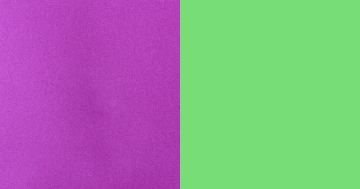
18. Green (#00FF00) And Purple (#A020F0)
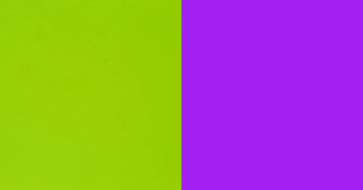
Pairing these two colors is ideal for designs depicting originality and glamour. Purple and green are warm colors that balance each other well. This color scheme is perfect for your living room and library. Make the background or walls a rich shade of purple, and fix accents of green such as wallpapers, faux fur, lampstands, and so on around the living room.
You can also style these colors appropriately by wearing a purple duchess gown for dinner with a green hat for added warmth.
19. Orange (#FFA500) And Purple (#A020F0)
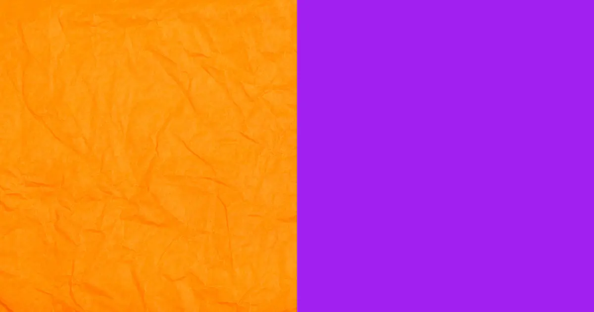
This combo stimulates creatively more easily than you could ever imagine. The combination of the regality of purple and the youthfulness of orange gives you a wide range of options for creating the best and most captivating designs.
20. Green (#00FF00) And Yellow (#FFFF00)

These colors are easily noticeable even from a distance. Yellow elicits feelings of happiness, playfulness, and optimism. Combining this color with green in your wardrobe helps to mimic the weather during spring perfectly. You will look stunning and bright.
For a true fashion statement, wear yellow joggers and throw in an oversized green shirt with your favorite green sneakers and a yellow bucket hat.
21. Pink (#FFC0CB) And Blue (#0000FF)

The softness of the pink color cools the warmth from the color blue. This palette is filled with cuteness and makes your designs beautiful and relatable. It has an element of both feminity and masculinity, giving it a quality of equilibrium.
For your interior, you could make either blue or pink the background with pink accents, such as lampstands, center rugs, and pink portraits or paintings around your home to accentuate the beauty of your living room.
You could also pair these colors to create a beautiful outfit. Wear a blue skirt, preferably a deep shade such as navy blue, with a pink blouse and blue heels. Pick your favorite blue handbag to match.
22. Blue (#0000FF) And Orange (#FFA500)

Blue enhances productivity, creativity, and imagination; orange also stimulates mental activity and gives you a smooth flow of ideas or train of thought. They are both energetic colors that work well in grabbing attention. This palette is suitable for designing products related to children’s toys, drinks, and food.
You can style your outfit with this color. Rock blue joggers with an oversized orange t-shirt with a blue and white Nike. Rock accessories of blue colors, such as watches, earrings, and a necklace.
23. Orange (#FFA500) And Yellow (#FFFF00)

Imagine placing the bright afternoon sun and the color of the sun while it sets side by side. That illustration is the reality of this beautiful palette. It involves the playful and bubbly nature of yellow and the intensity of orange.
This color combo is perfect for a relaxing interior. It is also suitable for branding food products, such as a food recipe app or website. It is also useful for designing beauty products.
24. Pink (#FFC0CB) And Black (#000000)

Black could come off at first as intimidating and mysterious. However, a blast from the cheerful pink color makes black sophisticated and accommodating. This color combination is ideal for your wardrobe. You can wear a pink gown and drape it with a black jacket to fit into the winter season.
Another option is to wear a pink skirt, either plain or a pattern white, a black sweatshirt, and black boots. Fix in accessories like a pink bucket hat, black wristwatch, and pink jewelry.
This palette is suitable for designing a girl’s bedroom. You can do this by making pink the background color and throwing around accents of black. For the wardrobes and floor tiles, make it a smooth combination of pink, black and white to balance the feel.
If you wish to infuse these colors in your interior without making it look too feminine, make black the background color, especially for your office as a female CEO. Fix in a pink lounge chair, bookshelves of pink and black, with a few accents of white.
25. Blue (#0000FF) And Yellow (#FFFF00)

Pairing these colors brings unique radiance to your designs. This palette inspires vintage designs, designs for transportation apps, and so much more. There is a wide range of options for using these two colors.
If you desire the most serene interior design, the infusion of yellow and blue is a sure bet. For a naturally bright interior, make yellow the background color. Arrange beautiful yellow furniture where necessary with yellow-themed artworks at strategic locations.
Accentuate the beauty of spring by wearing these attractive colors. Wear blue pants with an off-shoulder blouse or shirt. Complete your look with blue heels, shoes, or sneakers.
This palette is also popular in graphic design. You can use blue as the background or carefully incorporate both colors to make a background. Use a deep shade of yellow for eye-catching texts to fulfill that effect.
26. Pink (#FFC0CB) And Orange (#FFA500)
Pink is a vast shade that works excellently with so many colors, including one which lies close to it, orange. Their proximity to the color wheel makes them less popular as a possible color combination. Surprisingly, they make a very good pair. These colors are good to pair for your kitchen or dining to stimulate your tastebuds to enjoy food and the cooking process better.
You could make your kitchen tiles bright pink and the cabinets a playful texture orange with white or pink walls.
27. Purple (#A020F0) And Pastel Green (#77DD77)
When you think of pastels, think of something soft, fresh, and cool. Now imagine pairing a color with a soft tone with deep relation to nature with the elegance of purple. The union of these colors promotes relaxation, freshness, and health. This palette is suitable for designing supermarkets, and health products or website says.
If you wish to express an inner or subtle royalty in your interiors, use the purple and pastel green color combo. Start by painting your walls purple or making purple the luxurious theme of your home, and complete the sophisticated feel by adding accents of pastel green here and there.
Your accents of pastel green could include an armchair, sofas, pastel-themed artworks, and green plants to fully appreciate the beauty of nature.
28. Turquoise (#30D5C8) and Sand (#C2B280)

If you need an environment stimulating concise thinking and creativity, try using turquoise and sand colors. Turquoise is a mixture of pale blue, green, and a little yellow color, and the sand color is similar to the beach’s and linked to tranquillity.
The combination of turquoise and sand colors, especially during winter, gives you a feeling of warmth. These colors are exquisite for creating a cozy interior. Make turquoise the background color and fix in beautiful sofas of sand color and wall decors of sand or artwork of the beach in summer.
29. Beige (#F5F5DC) And Green (#00FF00)

This palette is ideal for your personality if you love nature or anything natural. Green evokes a feeling of rejuvenation and clarity, and the softness of beige cools this bold and bright color. This palette is ideal for designing agricultural products or graphics related to agricultural development.
Adopting this color combination in your bedroom will create a unique relaxing feeling. I can assure you that you will sleep better and wake up feeling refreshed.
Paint your walls a soft shade of beige, with little green decors of flowery patterns on the wall. Make your bedsheets a beautiful shade of green and beige. Also, let your wardrobe be a light shade of green with beige handles; incorporate this for your doors.
This palette is also ideal for styling your outfit in spring. Recreate the bright and rich atmosphere by rocking green pants with a beige shirt and black shoes.
30. Black (#000000) And White (#FFFFFF)

This is an all-time classic that has survived ages and remains popularly in trend. You could incorporate these colors into your dress to give off gothic vibes.
Black and white are complementary colors that exude intense emotions. Combining these two colors creates a perfect balance and harmony. It is common to see a black-and-white themed interior, especially for offices and homes. This palette is also very useful for creating simple and elegant designs, especially for luxury products.
31. Sailor Blue (#0E3A53) And Mint Green (#3EB489)
Sailor blue is a deep cyan blue color that is very warm and dull when visually analyzed. However, this dullness is brightened by adding mint green to fix some vibrancy and coolness to the palette.
Your outfit can look very sleek with this color combo. For ladies, you could wear a fitted sailor blue gown with a mint green kimono jacket and a sailor blue belt. For men, blue sailor pants and a mint green shirt are ideal. Black shoes or heels would go perfectly with these outfits.
32. Grey (#808080) And Lime (#32CD32)

The brightness and liveliness of lime green subdue the emotionless and sturdy nature of grey. Grey is a color widely used in industries and is strongly related to maturation, aging, and wisdom.
This combo is ideal for those who love to keep things simple yet delicate and sophisticated. For a cool fashion statement, wear a lime blouse or shirt with a grey skirt or pants, complete with a grey jacket and lime-colored heels. You could add some accessories in the color silver.
If you wish to create an aura of composure in your home, do not hesitate to make grey the background color of your interior. Include accents and designs of lime green at strategic points of your home to amplify the beauty of your interior.
33. Electric Blue (#7DF9FF) And Aquamarine (#7FFFD4)

This palette is a sweet and cool splash of the captivating beauty of blue. A clean, clear pool should give you a glimpse of what aquamarine color looks like. It is made from a careful combination of green, cyan, and blue and is a popular color choice for jewelry.
Electric Blue, on the other hand, is similar to cyan but lighter, and however, it is darker than pastel blue. Combining these two colors is perfect for making an ideal transition in designs. For an outfit, it is advisable to create an ideal monochromatic effect.
34. Cream Gold (#DEC05F) And Orchid (#DA70D6)
Cream Gold comes from the family of yellow, a warm color made from the combination of yellow and orange. Orchid gets their name and color from the beautiful orchid flower, and the pigment is made from a combination of red and blue with a little infusion of black and white.
The union of these two colors symbolizes rarity, nobility, and an atmosphere of romance. This palette inspires creativity, value identification, and self-awareness. This palette is suitable for branding confectioneries and other food products. For a gorgeous interior, paint your walls cream Gold and carefully arrange orchid-colored sofas and gold-themed center rugs or tables.
35. Black (#000000) And Yellow (#FFFF00)

This color combination bid popular in the fashion industry and undoubtedly has a wide range of applications when trying to get an ideal outfit. You could wear black pants or a skirt with a yellow blouse, shirt or sweatshirt with black heels or sneakers.
This palette is also suitable for designing a photography studio with appropriate lightenings to give your photos a spectacular result.
36. Black (#000000) And Beige (#F5F5DC)

This classic color combination fits perfectly into any context in graphic design, interior design, or fashion design. Stylishly combine black pants or skirts with a beige blouse to calm the effects of black.
This palette is suitable for designing products relevant to footwear brands. For your interior, make beige the background color and fix in black armchairs and others accents of black. This combo is also perfect for designing your kitchen. Paint your kitchen walls beige and match them with brown wooden floors. Complete this luxurious look with a black-colored cabinet and a tabletop.
37. White (#FFFFFF) And Sky Blue (#87CEEB)

The White and sky blue combination resonates with purity, peace, and grace. Incorporating these colors in your interiors makes them look brighter than normal.
To ensure you use these colors properly, apply the 60-30-10 rule. This involves picking a leading or background color, a supporting color, and an accent color. Make white your dominant or background color to cover your walls, and make the sky blue a supporting color for your furniture. Add accents of cream Gold or deep blue.
These colors are also applied in the health industry in designing the uniforms of medical professionals.
38. Pastel Pink (#F8C8DC) And Pale Green (#98FB98)
The union of these gentle colors in designs wastes no time grabbing your audience’s attention. Pastel Pink is made by mixing a little bit of white into pure pink color to soften the hue, and pale green does well in contrast to pastel pink.
For your designs, make pale green the background color and make little polka dots on the background with pastel pink. You could also wear a pale green dress, with a pastel pink hat or bag.
39. Tan (#D2B48C) and Black (#000000)

This combo is very popular in the fashion industry and strongly trends year after year. It is perfect for almost all skin tones and makes a prestigious design. You could wear a tan tank top with a black skirt or trousers and complete with a black pair of shoes.
Graphic designers can also use this palette to design flyers for coffee shops or luxury fashion stores.
40. Blue (#0000FF) And Silver (#C0C0C0)

Merging these colors creates a shiny feel of regality. The metallic sheen of silver pairs perfectly with the coolness of blue to create an alluring look. For a modernized and affluent fashion statement, wear a silver gown with blue heels or vice versa—also, rock accessories of silver from earrings, necklace, and a wristwatch to your classy silver bag.
41. Gold (#FFD700) And Silver (#C0C0C0)

Gold and silver are popular colors associated with luxury, and they complement each other well, with the coolness of silver rubbing off on the warmth of gold. This palette is useful for designing adverts for jewelry or luxury products and services.
It is advisable to wear one color and use the other as an accessory color for an outfit. For example, you could pair a silver gown with gold earrings, a chain, a wristwatch, and vice versa to look completely influential.
42. Torquoise (#30D5C8) And Silver (#C0C0C0)

The turquoise color is a cool and energetic color that depicts strength, wisdom, feminity, and creativity. In fashion, combining these two colors will help you look stylish and stand out among the crowd: pair turquoise pants or a skirt with a silver blouse.
For a sleek interior, turquoise the background and add silver sofas to the settings. Also, accents of silver are ideal.
43. Green (#00FF00) And White (#FFFFFF)

The color green rejuvenates and gives you a sense of vitality. To complete that aura of balance, complete the tranquility of white. This palette is suitable for designing the most comforting interior, especially for your bedroom. Make the background color white, and fix in several accents of green here and there. This will help you feel more comfortable and relaxed and help you sleep better.
You can style an outfit with this color combo. Wear green pants or a skirt with a white blouse. Complete your look with white shoes and a green handbag
44. Pastel Pink (#F8C8DC) And Grey (#808080)
This rich and gentle color combination is ideal for designing graphics, interiors, and your wardrobe. For an aesthetically pleasing atmosphere in your home, paint your walls pastel pink, and neutralize the feminine look with grey-themed portraits, sofas, and centerpieces.
45. Red (#FF0000) And Black (#000000)

This combination is an age-long gothic style that can never go out of trend. This palette resonates with power, vigor, and intense emotions. A good way to combine these colors to ensure balance due to the intensity of each color is to make one solid color and the other in patterns for your design.
Findings have revealed that red enhances creativity and mental capability, making it an excellent option for designing your office or study. To properly style this palette into an outfit, wear more red and black as accessories.
46. Purple (#A020F0) And Pale Green (#98FB98)

This palette is an all-time favorite, with purple strongly associated with royalty and green with nature. This color combination will make you feel like a royal with influence and wealth.
47. Wine (#722F37) And Pastel Yellow (#FDFD96)

This palette depicts the smooth balance between the color wine’s intense hue and pastel yellow’s calmness. Wine has a deep association with luxury, celebration, and romance.
It can be applied to interior designs by painting your walls a rich shade of wine and adding accents of pastel yellow here and there. For a more sophisticated look, fix pastel yellow-themed decors on the walls.
48. Black (#000000) And Dark Green (#023020)

The combination of these colors makes a powerful palette. Black evokes elegance and a thrilling aura of excellence combined with dark green’s mysterious and eye-catching nature. This palette is perfect for designing a website’s luxury products and landing pages.
You can style these colors into a perfect outfit by wearing a black skirt or pants and a green blouse, then complete with black shoes.
49. Blue (#0000FF) And Gold (#FFD700)

This pretty color combo resonates with wealth, power, and influence. This stunning palette is useful for designing the most attractive interiors. You can paint your walls color blue and carefully arrange blue-colored antiques at strategic points in your home. The union of these colors is useful for styling elegant prom or evening gowns.
50. Pale Lilac (#C8A2C8) And Lime Green (#32CD32)

Lime Green is a beautiful bright color that radiates youthfulness and health. Combining this color with pale lilac creates one of the softest and most attractive color schemes suitable for designing, fashion, and interior design.