Everything around us has an attribute of color; our skin, beautiful eyes, favorite clothes, and even our environment. Colors define us and somehow affect how we feel or express ourselves.
If you love to explore colors, you must have seen a recent trend of soft-looking colors on runways and graphic designs. These soft colors are Pastel Colors which I love to describe as classy and elegant.
With my carefully crafted write-up, I am optimistic that you will appreciate this new trend, gradually replacing the standard colors with a fixed saturation and hue.
What is Considered a Pastel Color?
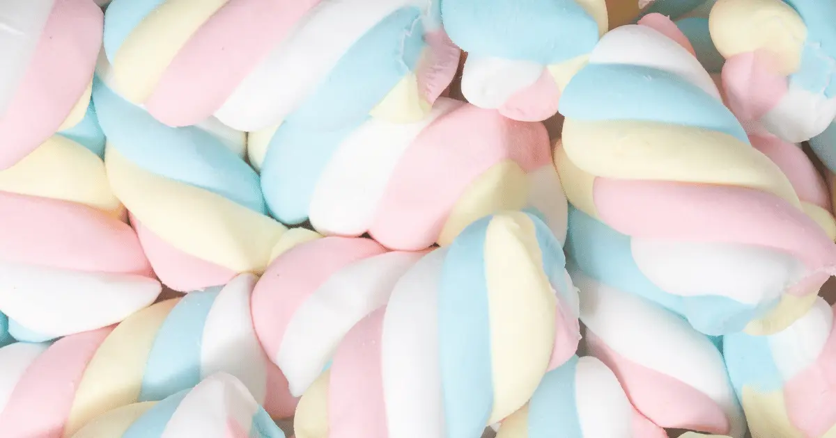
Any pale version of a bright color is described as Pastel. These colors are muted or soft and are created by adding a careful amount of white into the original color shade. For example, mint is a pastel of green, and lavender is described as a pastel of purple, etc.
They get their name from the historical pastel sticks similar to a crayon of low saturation and used in making high-value pastel art.
These pale colors are much more than using them for a gender reveal or painting an Easter egg. You can apply them in everyday life, especially if you’re a massive fan of aesthetically pleasing arts or classy fashion trends. You can look gorgeous in a pastel dress or paint your apartment in satisfying light colors.
Are Pastel Colors Out of Style?
These colors were once considered typical for children, especially in a daycare. It was once attributed to feminity and anything soft, gentle, or delicate. If you are scared of looking odd or getting unpleasant comments about your pastel style, I suggest confidently exploring it.
Nowadays, the once babyish colors are entirely in vogue, plus people see them as elegant, classy, and graceful. Interestingly, despite its muted or light nature, it easily stands out among other colors. Men who love to explore colorful fashion trends can also adopt pastel colors.
Several combinations are ideal for a perfect outfit you could rock for a date or an event.
Are Pastel Colors Warm or Cool?
Pastel colors are cool to some and may be warm to others. It is important to note that the amount of orange in color determines the extent of its warmth, while the amount of blue determines the degree of its coolness. Pastel colors are easily created with white to any original color shade. With that in mind, these colors cannot be called either warm or cool.
What Effects do Pastel Colors Have on my Audience?
As I mentioned earlier, colors affect how we feel, think, and act, and it affects how we perceive things and determine the decisions we make about an object or product. With this understanding, you can skillfully use colors to capture your audience’s attention and promote your business or website.
People tend to divert more to using bold and unmistakable colors to achieve this. It is excellent to know that with pastel colors, you can use people’s emotions to your advantage. These colors create a calming effect in a person and send a bold message simultaneously.
An in-depth understanding of the color psychology of pastel colors will teach you how to apply it, making designs that send the right message to a specific audience. Also, it would help you get information regarding how people view particular colors. While some see Pastels as elegant, some see them as meaningless.
By understanding the disparity in individuals’ thought processes, you can create a balance that satisfies your audience’s view of your design capable of promoting your product.
• Produces a Calming Effect
Since Pastel has a softer or washed saturation, unlike the original color, it easily elicits a soothing feeling in the minds of your audience. They feel calm and would view your design as entirely serene.
Refrain from stereotyping pastel colors; for example, limiting baby pink to a baby’s room or daycare only. There are many beautiful ways you could apply these colors to create outstanding designs for your audience.
• Its Beauty Resonates With Hope
Pastel has a unique ability to brighten people’s moods because of its easy association with the feeling of optimism.
• Sparks Romance
These days, a bright red color is barely associated with love anymore. The Pastel light pink is gaining popularity among romantics who wish to express their passion uniquely, and it redefines and beautifies how people perceive and interpret love.
With the application of Pastels in making designs relevant to romance, your audience would see love as something to cherish. Pastel’s delicate look and feel prompt them to protect that feeling of love they find adorable.
• Effortlessly Speaks Elegance
At first glance, pastels are simply graceful and versatile and attributed to anything with style, class, and grace.
• All About Spring
Spring is easily associated with pastel colors because of its colorful nature. This tremendously affects how people feel; they feel deep joy and calm.
Some Popular Pastel Colors
• Pastel Green

Hex Code: 77DD77
This muted version of the original green color can be easily linked to the environment. Pastel green sends a message of calm, hope, and renewal. There are specific colors that share a resemblance with Pastel green, mint, and teal green.
To create your unique pastel green, mix in the primary colors, blue and yellow, to give you a green color. Afterward, activate the pastel color by adding some amount of white. Keep staring the white in until you are satisfied with the intensity or soft saturation.
You can refreshingly use this color. Because of its soft and calming nature, you can use it as much as possible, either in interior design or clothing, to give you a vintage feel. This color is also linked to health and is often employed by supermarkets or pharmacies to depict quality health status. Pastel green and lilac are a popular and perfect combination.
• Pastel Brown

Hex Code: 836953
This shade of brown is an exciting one that gives room for exploration and finding a perfect balance, especially in painting.
To make pastel brown, take your palette and add blue paint to an equal amount of yellow. Squeeze in your red color and mix thoroughly till you get a perfect blend of brown color. Now to the exciting part, add a small amount of white paint, mixing till you get your preferred tone of Pastel.
This shade can be used in furniture designs, and it is exquisite. In fashion, brown-skinned women can use it to accentuate their beautiful skin tone.
• Baby Blue

Hex Code: 89CFF0
The first thing that comes to almost everyone’s mind at the sight of this color is babies and daycare. This cute and vibrant color is created by adding a graded amount of white color onto an original blue shade till and incorporating it to give a beautiful pastel shade.
You can do much more with this color than using it for a gender reveal. You can incorporate it into your wardrobe by combining cream for an exquisite look or a complementary color like deep blue to give off an elegant vibe.
• Pastel Turquoise

Hex Code: 99C5C4
This eye-catching color is ideal for creating designs relating to skincare, jewelry packaging, and interior decor. To start, add a tiny amount of yellow to the color blue alongside some white and stir properly to reveal the soothing pastel turquoise.
• Magic Mint

Hex Code: AAF0D1
This color is birthed from the family of green. It is closely associated with nature and is perfect for home designs to give a relaxing feeling. Other variations similar to this color are mint blue and seafoam green.
• Pastel Lilac
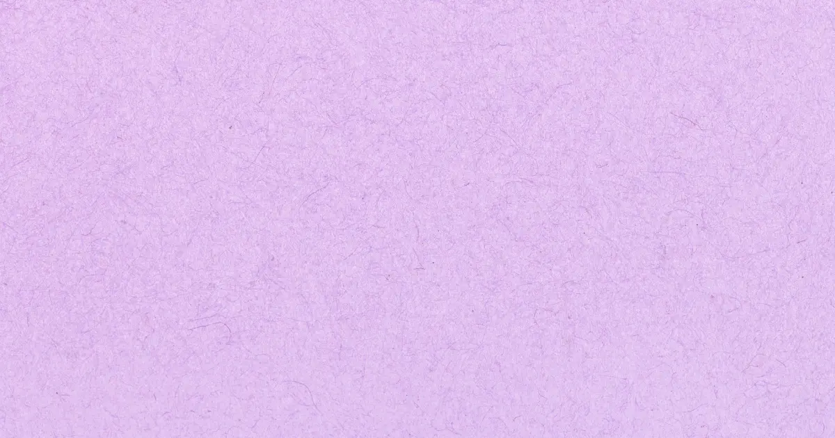
Hex Code: C8A2C
Lilac is a beautiful pale version of purple. This color which got its name from the lilac flower has a rich history. Purple is associated with royalty and wealth due to how expensive it was to get a purple dye in the 1800s.
To create this soft color, mix red and blue to give a relatively purple color. Afterward, add a little white paint to unveil your pastel lilac. The presence of the color red gives it warmth.
• Pale Mauve
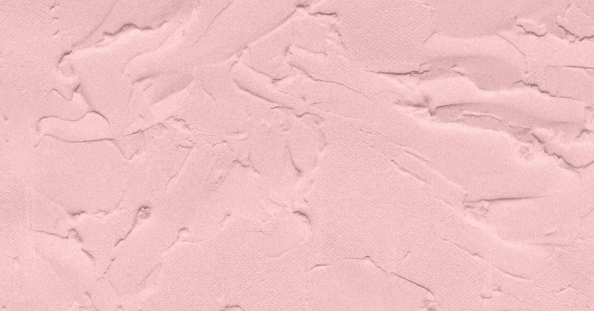
Hex Code: E0B0FF
This pretty color with a purple tone gets its name from the French word Malva, translated as a mallow flower. This color was accidentally discovered in 1856 by an English chemist known as Williams Perkin. Mauve is associated with purity, youth, and royalty, and this color goes well with blue, teal green, or black.
• Pastel Red

Hex Code: FF6961
Pastel Red is a lightened version of the color red. To create this color, you might add some white to it to make the usual pastel color. Putting white in the color red would turn it pink and leave you in confusion.
To create this soft color, mix orange into red to lighten it without ending up with a pink tint. You could add just a little drop of coloring white to lighten the hue.Usually, red is associated with danger, love, and high intensity. The good thing about pastel Red is that it can reduce this intensity to represent a soft and gentle romance.
• Baby Pink
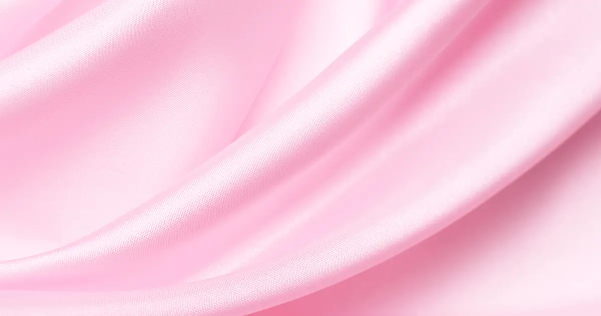
Hex Code: FFB7CE
This cute color attributed to baby girls is in high demand. It is used to express beauty, feminity, and grace.
Is Khaki a Pastel Color?
You might wonder if khaki can be classified as a pastel color. Khaki corresponds with the hex code ADA96E, a pastel yellow.
How Should to Pick Pastel Colors?
This will depend mainly on how you wish to apply pastel colors. For graphic design, use any soft pastel for the background to help your audience focus attention on your product or content. There are also unique pastel combination ideas that you could explore to get the perfect graphics for promoting your product.
If you wish to explore pastel colors in making a bold fashion statement, you can consider combining colors like Pastel blue and cream, pastel lilac and white, and so much more. Do well to explore a carefully packaged array of pastel palettes.
How Should to Wear Pastels?
Adding pastels to your wardrobe is an excellent way to tap into the growing trend. There are various ways to style your pastels to look chick, sleek, elegant, and glamorous. You could go for a sophisticated monochrome pastel, combine two or more cool pastels or combine it with a bold color.
Will Pastels Make me Look Tan?
Pastels work excellently in giving warmth to your skin, making it look tan, or enhancing it. The goal is to pick a pastel dress that perfectly contrasts the color of your skin. Examples of pastels that would suit your skin tone are pink, green, mint, yellow and blue.
Do Pastel Colors Look Good at Night?
They are stunning. The elegant nature of Pastels makes it easy for your dress or design to stand out, especially during dinners. You could opt for Pastel with a bright statement color such as pastel turquoise and orange. Some accessories come in the form of pastels to give you that balance and, at the same time, express your style.
Do Pastel Colors go With Grey?
Grey is not just a neutral color but also versatile and pairs beautifully with pastel colors. For example, pastel blue matches well with Grey giving off a pleasant vibe of nature and eliciting a calming effect. Pastel and grey combinations are graceful and classy.
Final Thoughts
Pastel colors will most likely remain in vogue, especially in the fashion industry. Product designers harness the impact of Pastels on the audience to bring their products to the limelight. You create a calm environment by adopting the use of Pastels in your interior designs.

