

Colours are a powerful medium through which we can express ourselves. Different Shades of colours carry different meanings and have a way of influencing our behaviour, mood and thought process.
Web Designers, interior design experts and fashion designers understand what powerful tool colours can be. They can influence people’s views about their brands and gain attention through that medium. All these can be achieved through careful colour combination.
You might wonder if combining four colours without a clash is possible. You can do so if you follow my carefully sculpted amazing colour combos in this article.
Why Should I Pair Colors Together?
You may try to avoid pairing colours because you always merge the wrong shade or need a solid understanding of how colours work. Combining colours might be tricky, but it is fun and adventurous, and the results are rewarding.
Is combining four colours worth it? If you ask a graphic designer, they would most likely tell you how exciting such combinations could be. Apart from having four different colours to create a unique combo, you could incorporate four different shades of the same colour.
As an artist, you can integrate several colours in your painting to capture the perfect idea and attention. Better still, you can create precision and depth and express yourself in several ways on one canvas. Creating realistic and relatable artworks peculiar to the world around us is also easier.
Four Colors That Look Great Together
The colour wheel is an excellent way to ascertain what four colours go well together. It is a tool developed to illustrate the relationship between colours by arranging them as a wheel. The hues, saturation and other qualities of every colour are compared. With the colour wheel, you can easily create several combos unique to your brand, wardrobe or interior.
The term used to describe incorporating four unique colours is called tetradic colour combination. Imagine a rectangle drawn from one point of the colour wheel to another. The four corners or points equidistant from each other signify four possible colours that would look great when combined.
Here is a list of twenty unique colors that look superb when integrated.
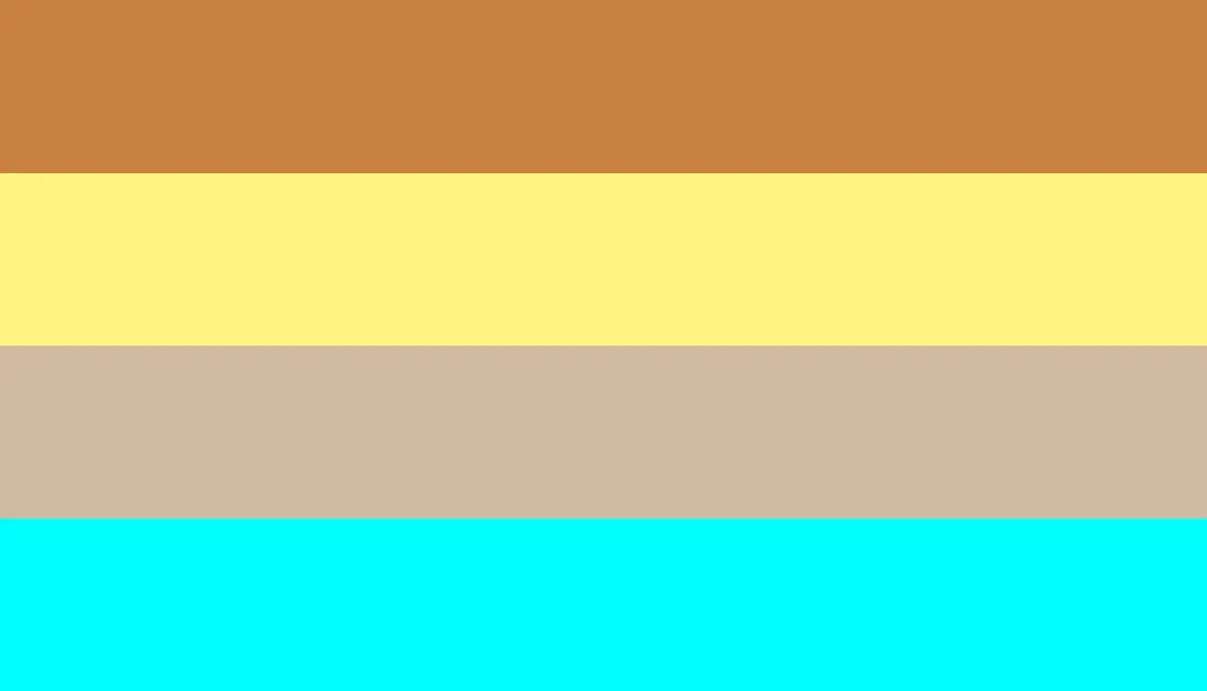
1. Light Grey (#D8D0CD), Dark Orange (#B46543), Light Red (#FF7F7F) And Raspberry Pink (#C83F5F)

This combination is a play between the calmness of grey and light pink and the warmth of orange and pink. This palette is perfect for making designs relevant to product branding. Such brands include; new eye-shadow pallets, confectioneries and products related to feminity. You can blend light red or pink as the background with dark orange as the font or call-to-action.
You can combine these colors beautifully to create a calm environment for your interiors. In your room, you could paint your walls light red or pink with accents like lamps, sofas, and door handles a beautiful shade of grey.
Also, get bedsheets or blankets that are a combination of white and raspberry pink. To finish up the beautiful ambience, decorate the mattress with pillows of orange color.
2. Bulgarian Rose (#480607), Aegean Blue (#4e6e81), Honey (#EBA937) And Persimmon Orange (#EC5800)
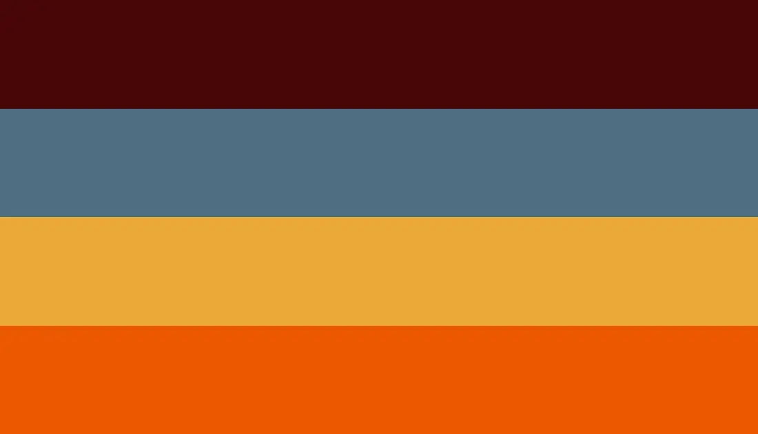
These colors are welcoming and captivating. Bulgarian Rose looks as beautiful and satisfying as it sounds. Aegean blue perfectly balances between blue and teal green to create harmony. The honey and orange colors are soft, classy and inviting. You would always go right integrating these colors.
Wear a blend of honey and orange blouse over blue pants with a luxury rose-coloured handbag to make a striking fashion statement. You could also wear honey-coloured heels and persimmon orange accessories like wristwatches, earrings, necklaces and bracelets.
3. Sage Green (#B2AC88), Silver Pink (#C4AEAD), Orange (#E36858) And Black (#0C0D0D)

This palette is a blend of soft to bold colors for professional use. Sage Green prides itself in its freshness and close resemblance to nature, while silver pink has the glamour of silver and youthfulness of a pink hue. Merging these satisfying colors with intense colors like orange and black gives you a sense of clarity and balance.
You can infuse these colors to arrive at a sophisticated interior. Paint your walls a rich orange color and neatly arrange cushions and armchairs that a colored black. You could also make use of a black work table and chair.
Soften the effects of these colors by adding a mixture of silverish-pink and green throw pillows. You could also have your doors a rich hue of silver with handles of sage green. For your centre rug, have them in a beautiful silver and green color.
This combo is also very useful for branding or advertising a new clothing line, men’s shoes and luxury perfumes. Using black as the background or point of focus would send a message of class and luxury. Infusion orange will waste zero time in grabbing the attention of your audience.
4. Strawberry Pink (#fc5a8d ), Pastel Magenta (#F49AC2), Pastel Coral Azure (#9EE8E1) and dark chocolate brown (#7B3F00)

These colors are playful and often used to depict feminity and anything sweet to your tastebuds. This combination is ideal for promoting pastries and candies. Think of a flyer advertising a chocolate cake and imagine the delicate blend of pink, magenta and coolness of coral blue.
You could create a dashing outfit with these colors as well. Imagine a chocolate-colored office skirt, pink blouse, pastel magenta heels and a beautiful blue bag. Silver-coloured accessories work well with this combo.
With the help of an interior decor expert, you could combine these colors to give your home a dreamy ambience rich with happiness and laughter.
5. Baby Blue (#89CFF0), Gentle Doe (#E9B796), Peach (#FFE5B4) And Burnt Umber (#962E2A)

This combination is a blend of cool, soft and nursery-friendly colors. If you need colors to bring some sunshine into your home, do make use of these colors. For your nursery, paint the walls a beautiful shade of peach and have toys and play area much of blue and touches of gentle doe and burnt Umber.
These colors are also very useful for branding makeup products, especially foundations for chocolate brown skins. It is also ideal for designing websites to attract and maintain youthful energy.
6. Pastel Pink (#F8C8DC), Pearl Aqua (#80C4B7), Pastel Yellow (#FDFD96) And Papaya Orange (#E56717)
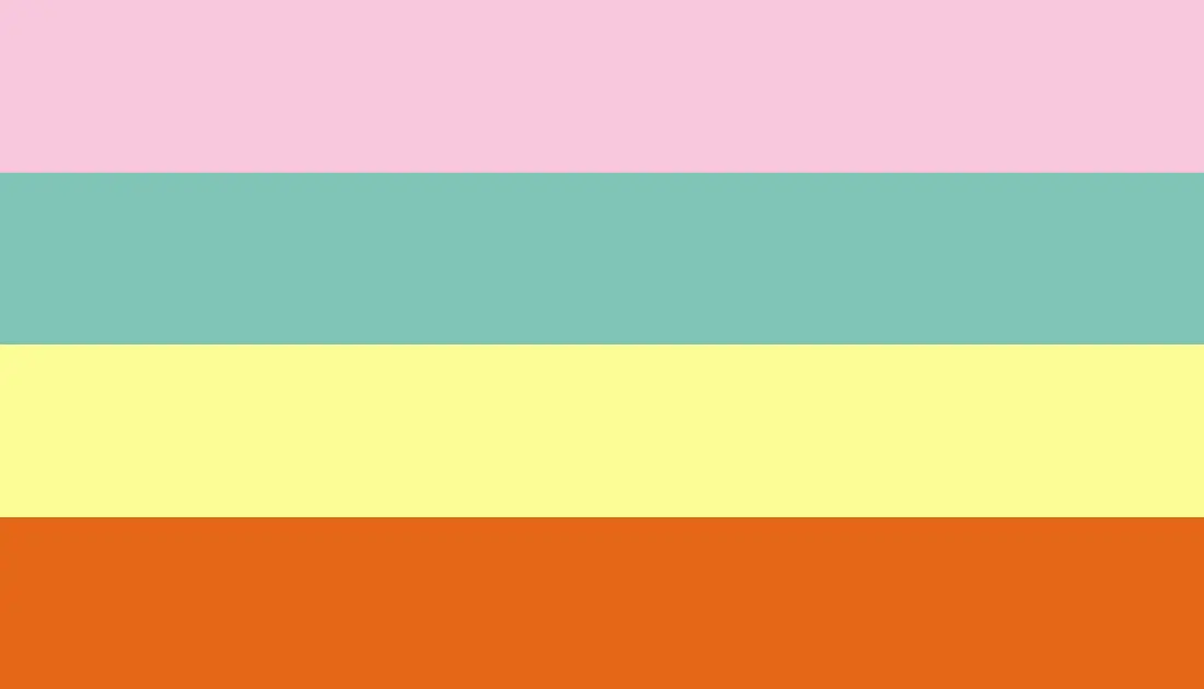
Pastel colors bring a unique feeling of peace and promote calmness for a long while. A unique blend of these pastel colors with vibrant orange and pearl aqua softness can reduce stress by bringing calmness.
Even though they have a childish element, they are amazing when applied to interior designs. You would step into your home daily feeling rampant happiness and completely relaxed.
Your designs would be completely comforting and, at the same time, eye-catching with these colors. They are ideal for designing websites relevant to diet and nutrition.
7. Neon blue (#1F51FF), Mustard Yellow (#FFDB58), Powder Pink (#FFB2D0) And Pastel Orange (#FAC898)

Including mustard yellow in this palette makes it ideal for designing your home’s kitchen or dining area. Integrating these colors makes your kitchen inviting and aesthetically pleasing.
Start by painting your walls mustard yellow; don’t be afraid to go bright and bold. Make your tiles neon blue for a dreamy effect and cabinets a mixture of powder pink and pastel orange for a perfect feel.
8. Burnt orange (#CC5500), Marigold (#EBA832), Pickled Bean (#6C3622) And Aquamarine (#7FFFD4)
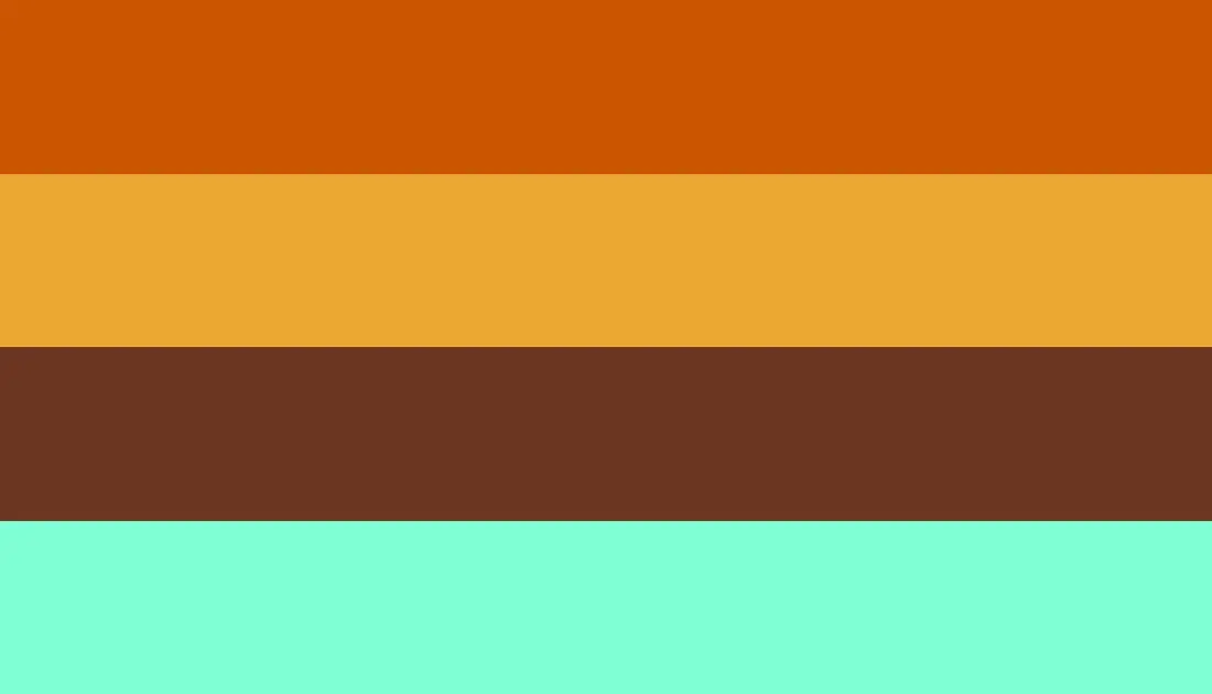
A glance at this palette will reveal an amazing balance between the refreshing feel of aquamarine, which reminds me of a clear, cool lake, and the confidence of burnt orange. Marigold, which got its name from the beautiful flower, rests between orange and yellow.
The duty of marigold in this palette is to infuse some element of brightness into whatever you are applying these colors into. Pickled Bean is synonymous with deep or dirty brown, perfect for your interior as a wooden tile. To make your home feel luxurious, infuse these colors in your bedroom, dining or study.
9. Light Green (#B6E696), Bright Pink (#FF69B4), Blue (#0000FF) And Purple (#A020F0)
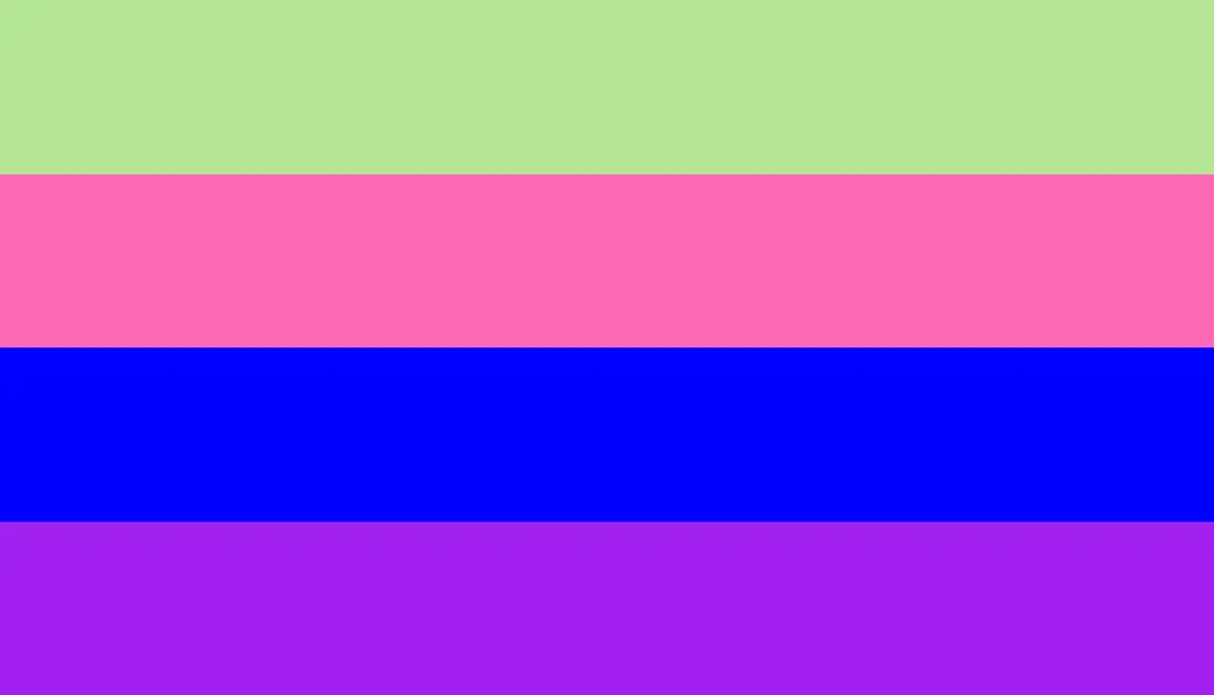
These colors evoke the strongest and purest emotions. The presence of purple in the palette makes it ideal for representing anything connected to royalty, class and influence. This palette is youthful and electrifying. When applied to your designs, it gets the most attention effortlessly, and every message is absorbed.
You could also explore this color combination to create the perfect outfit. You could wear purple palazzo pants, a pink turtleneck blouse, and purple boots. Complete your look with a blue and green purse and accessories.
10. Dark Sage (#6d765b), Earth Brown (#BC815F), Zorba (#A29589) And mahogany (#C04000)

This stunning palette is ideal for making your interior uniquely beautiful and comfortable. If you wish to feel close to nature in your home, you could paint your walls in Zorba, and accentuate the calm feel with Sage-colored armchairs.
Include a mahogany centre rug or table and brown earth lamps, portraits or wall designs, with brown throw pillows. This combo gives off a unique resemblance to the nature around you.
11. Gainsboro (#DDDBDE), Columbia Blue (#CAD4DF), Blue Grey (#656E77) And Fuscous Grey (#3B373B)

These are perfect colors for those who love to keep their designs, outfits and interiors simple and are at the same time elegant. This minimalist palette consists of unique shades of greys, neutral colors and monochromatic.
The results from using this palette are professional, simple and stylish. It is excellent for branding new fashion wears for men and luxury watches. This color combination is also ideal for your office interior, especially if you are a CEO; this will give your office an aura of effortless authority.
To look classy and sophisticated as you go to work, you could match these colors to create the perfect office wear.
12. Sky blue (#87CEEB), Rose (#FF007F), Fuchsia (#FF00FF) And yellow (#FFFF00)

This palette speaks nothing less than fun with a playful attitude. It attracts attention easily, which makes it ideal for web designing. You could also infuse these colors into your study room to make reading enjoyable. This palette broadens your creativity and inspires intuition for problem-solving.
Incorporate these colors in your study by painting your walls a rich hue of sky blue. Have your bookshelf a blend of fuchsia and yellow. Your curtains should also be a blend of yellow and rose. Finish the look by having a yellow colored table and chair.
13. Tiger orange (#C88141), Corn Yellow (#FFF380), Classic Taupe (#D1BAA2) And Cyan Blue (#00FFFF)
This palette is as relaxing as a sunny day on a lovely beach. They represent liveliness and the energy of youthfulness. These colors are superb for designing products related to swimwear, sunscreen for a hot summer and bright makeup products. They are ideal for decorating or beautifying a nursery to capture the innocence and cuteness of children.
14. Purple (#A020F0), White (#FFFFFF), Lime (#32CD32) And Slime Green (#299617)
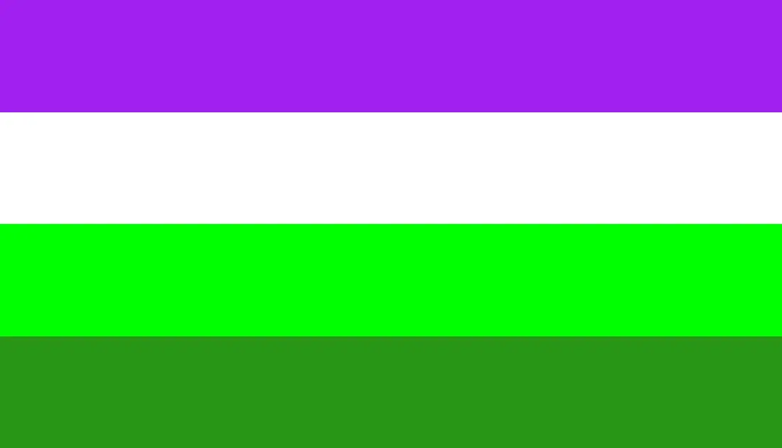
This palette goes back and forth between regality, purity and fertility. It is ideal for making the most colorful yet glamorous outfit. You could wear lime, slime green trousers, a skirt, and a white blouse. Throw in a purple overall or jacket and wear a pair of green slime shoes or, better still, white shoes.
You can also infuse these colors in your interiors, especially your living room. Paint your walls white to depict how you cherish cleanliness and have your couch and armchairs a delicate shade of purple. Arrange white throw pillows on your couch and have your curtains mix lime and slime green to create the feel of nature.
15. Blue (#0000FF), Mustard Yellow (#FFDB58), Mauve (#E0B0FF) And Green (#00FF00)
This intense colour combination expresses the brightest emotions, such as love, happiness and romance. It combines warm and cool colors, which are rather bold. They are ideal for branding products related to confectioneries, designing websites strictly for food recipes and establishing call-to-action on websites.
These colors grab attention easily and are likely to remain in the minds of your audience for a long time. Its bright burst of colors makes it easy to absorb and comprehend information.
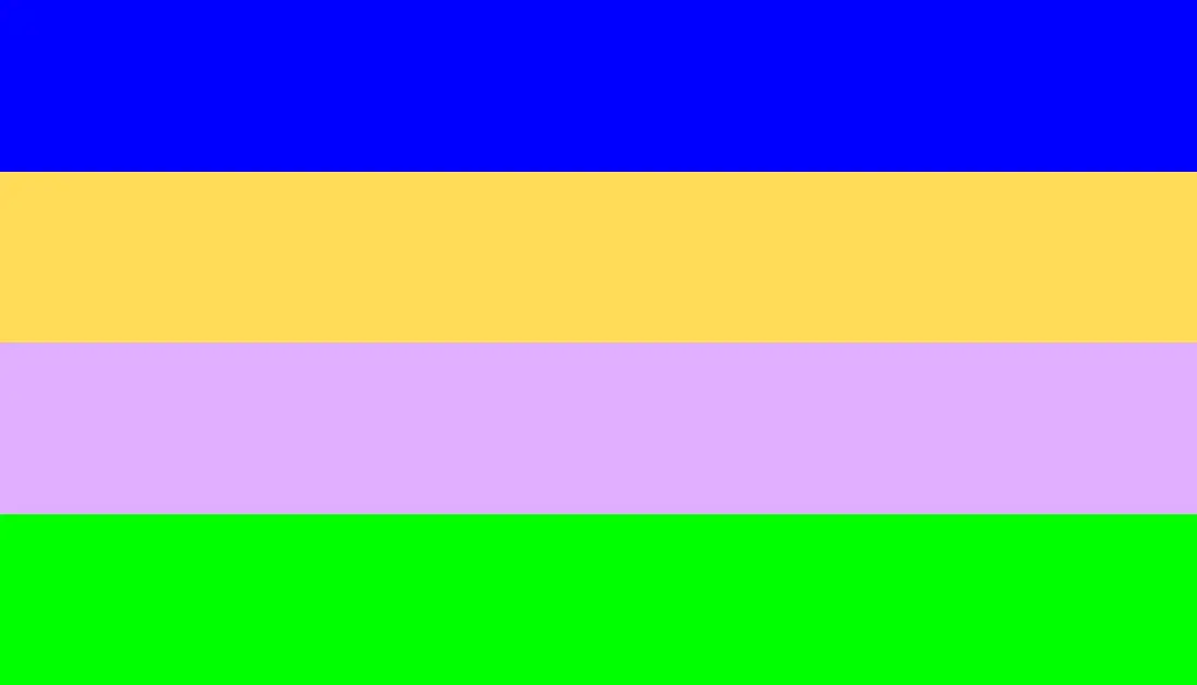
16. Dark Blue (#00008B), Green (#00FF00), Pink (#FFC0CB) And Orange (#FFA500)
Dark Blue and orange are complementary colors on opposite sides of the color wheel. To further accentuate these colors, infuse a mixture of green and pastel pink. These colors make designs relevant to interior decor and school websites.
17. Sunshine yellow (#f4db87), Nude (#E3BC9A), Deep pink (#AA336A) And Deep Purple (#301934)

The presence of nude colour in this palette does well in bringing an element of neutrality within the bold and bright colors. You can use these colors for a vibrant, classy interior, branding, and product design.
18. Crystal Ball (#355952), Vivid Mulberry (#B80BCD), Rose White (#FAEDE7) And Pastel Red (#FF6961)
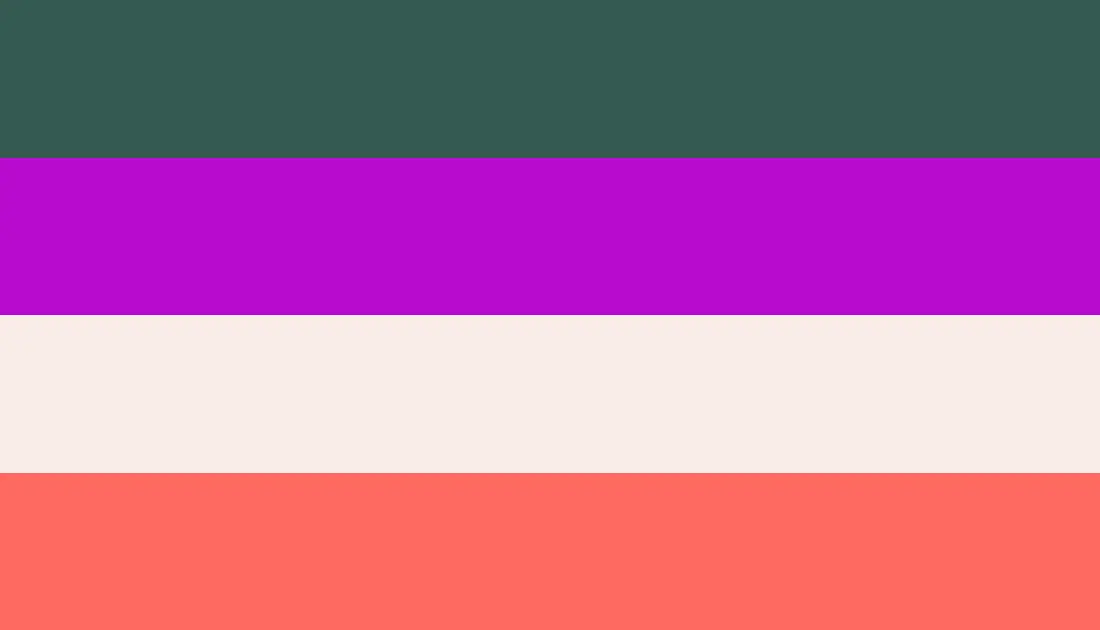
A combination of these colors gives off a dreamy appearance. This palette is ideal for adventurous people who need something exciting to create new designs and creatively create a perfect interior.
You could rock mulberry pants with a rose-white sweatshirt for your wardrobe. Rock a pair of crystal ball or pastel red boots. Accessories of black or mulberry do well in accentuating the beauty of these colors.
19. Frostbite (#E8338B), Red Violet (#922B3E), Grape (#5D345C) And Indigo (#4B0082)

This palette is perfect for creating the most exquisite designs. This colour combination is ideal for you if you desire an interior that expresses how glamorous and classy you are. The amazing flow of different shades of purple proves elegance. You can also adopt these colors in your wardrobe for a bold fashion statement or to stand out.
20. Sky blue (#87CEEB), Teal (#008080), Seafoam Green (#93E9BE) And Chartreuse Yellow (#DFFF00)

These colors create a contrast that is both relaxing and captivating. The amazing blend of sky blue and teal gives a soft and comforting effect, while the infusion of seafoam green and yellow reminds you of the beauty of nature. This Palette is ideal for designing products that require a playful touch, and you could use them for branding a clothing line for babies or baby products.