
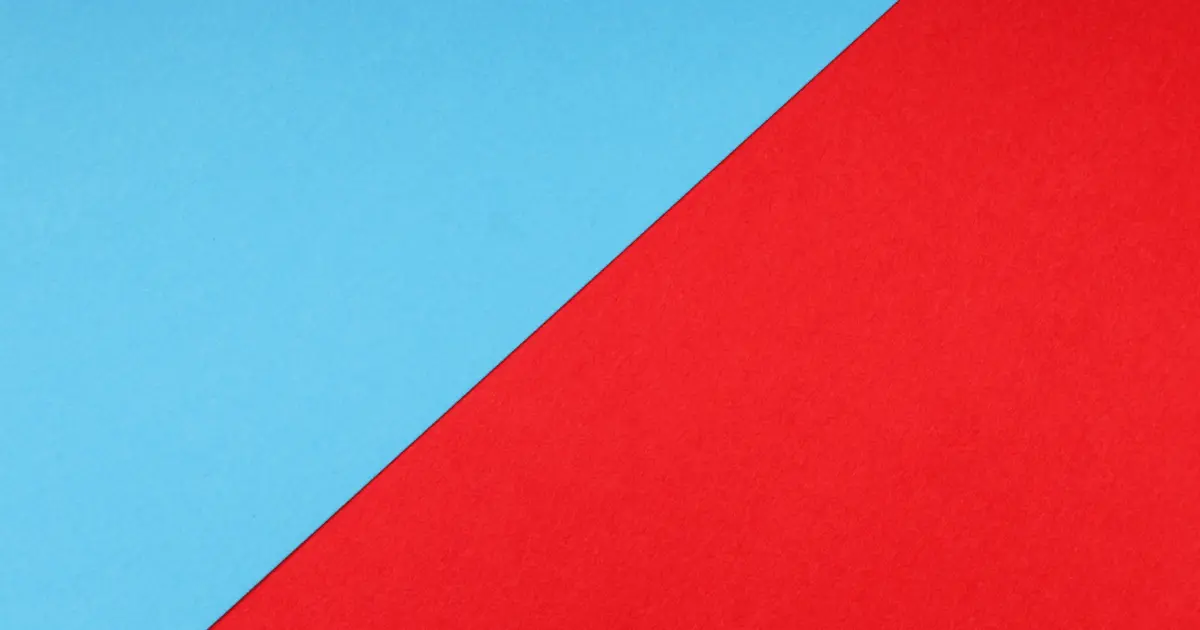
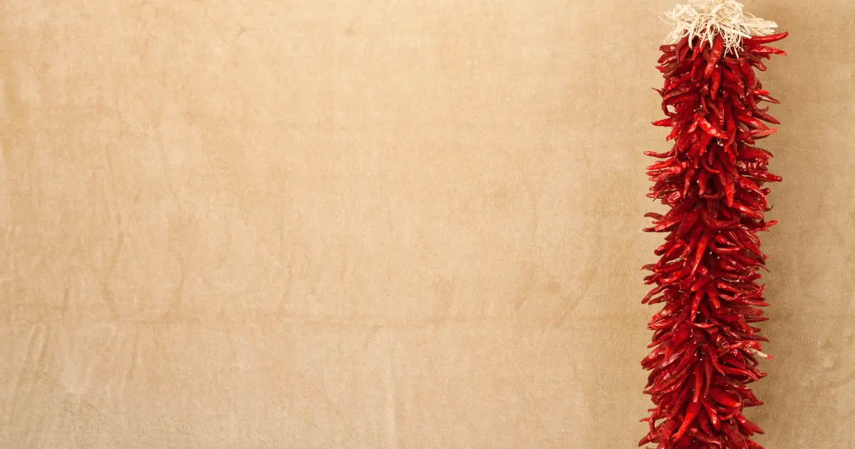
Red is a warm-toned primary color, and it is the color of passionate love, seduction, violence, danger, anger, and adventure. Our prehistoric ancestors saw red as the color of fire and blood – energy and primal life forces. And a lot of the symbolism associated with red today comes from its influential past associations.
It is one of the color wheel’s most striking and daring colors. However, you must know which colors complement red and how they influence your interior design.
What Colors Go With Red?
Red can sometimes get boring or too pronounced when used alone. You can explore several other colors which you can pair perfectly with red. Unleash your inner creativity with my curated list of twenty beautiful colors which pair well with red.
1. Red and Green

Complementary colors consist of a primary color and a secondary color. Combined, they cancel each other out by producing a grayscale color like white or black. On the color wheel, Red and Green are complementary colors found in art and nature.
They are also the colors used to celebrate Christmas! Christmas is already around the corner. Look no further you just found the perfect fit for your home decor. After the festivities, you might switch to something else, so I recommend you use a touch of red and green in temporary decorations like ribbons, wreaths, and fir branches.
For your decor, go for dark green fir branches to maintain a calm and fresh aesthetic. Ornaments, garlands, and centerpieces with fir branches look festive. You can add accents with holly berries and scarlet ribbon for a lovely yet organic appearance. However, there is a choice for you if you want to avoid a Christmas impression when combining red and green.
With cool pistachio green wall paint and cozy red accents on the floral drapes, you can use a milder variation of this classic combo.
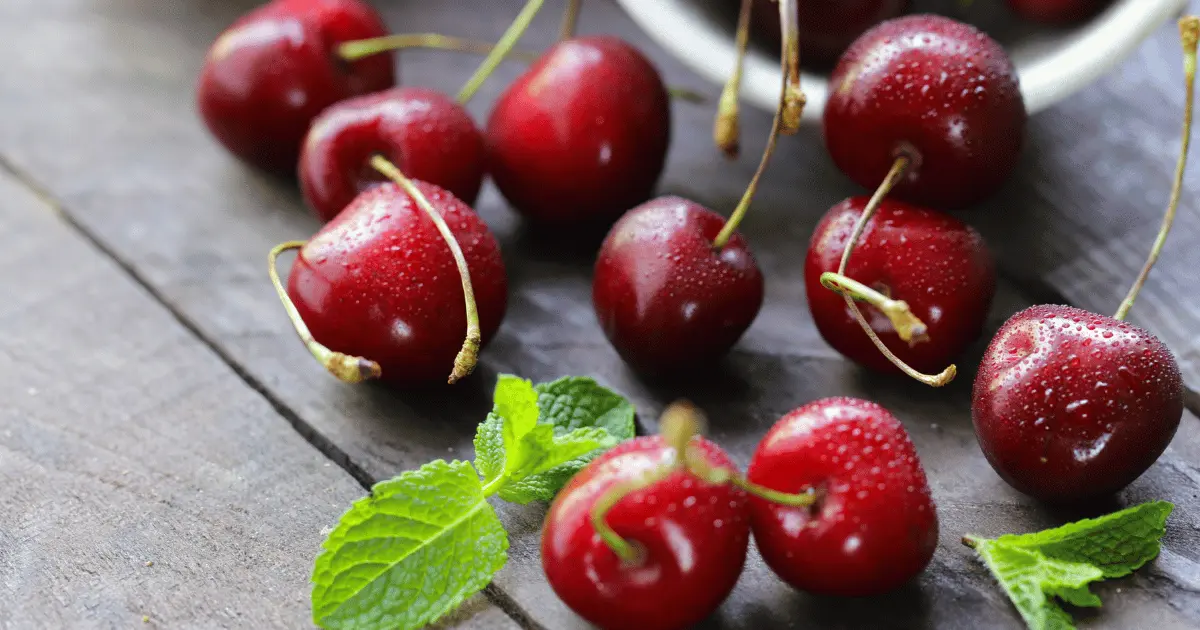
2. Cherry Red and Chocolate
Chocolate is a dark shade of brown. If you want to add some life to your house while staying true to your aesthetic choices, this is a terrific combo for you to try. In the words of Allison Paladino of Paladino Rudd Interior Design, “chocolate and cherry red combined are wonderful, like chocolate with a cherry filling.
The color scheme is fantastic and ideal for a classic, opulent library. In addition to interior ideas, this color scheme works beautifully for elegant fashionista attire. The rustic brown tone and the vivid crimson go together beautifully, and it has never been so simple to look effortlessly trendy.
If you want to play it up in the shoe department, try pairing a red shirt with brown leather tapered slacks and finishing the ensemble with tan cutout ankle boots.
3. Red and White
Red and white are certain to come to mind whenever you think about love and Valentine’s Day. White conjures up purity and innocence, while Red represents passion, which is why they create a great color combination for Valentine’s Day!
This color palette is used by several well-known companies in their logos or goods, including Coca-Cola, Adobe, and Netflix watermarks, to name a few. Even well-known energy drinks like Red Bull employ the power of Red to indicate vigor and endurance.
When you combine this energizing color with white’s cool undertones, the result is nothing less than heavenly. Talk about opposites attracting. They are a fantastic option of colors for interior design. You can focus on the sculpture and crisp lines of the contemporary space by creating a minimalist living room with a rigorous white and red color scheme.
When it comes to work attire for women, a red top, white slacks, white shoes, and a white bag are sure to make you look stunning and turn heads among your coworkers.
4. Cherry Red and Pale Grey
Grey is a color that sits in the middle of black and white. It is an achromatic or neutral color. It means it is “without color” because black and white can be used to create it. When it comes to home décor, we frequently avoid the color red and miss out. But the color red stands out brilliantly against the neutral backdrop of grey.
Due to its superior visual appeal, grey serves as a better catapult than a white wall. It applies to all house furnishings and decor, not just furniture. Red is a very cheery and elegant hue if utilized in the appropriate proportions and matched with the rest of the decor. A fiery cherry red sofa in your living room gives the traditional design a modern twist.
Additionally, you may use a cool grey wall color to give contrast, a chrome coffee table with a glass top to add lightness, and gold accents to offer glitz or sheen. For formal attire, grey is an outstanding color choice. Gray has a cool tone that makes the red stand out and dominate.
If you’re dressing for a formal event, add a hint of red to your plain grey formal-fitting gown with red heels, a red bag, and a piece of red jewelry. Apply bright red lipstick to seal it.
5. Red and Black

Black is an achromatic, hueless color used with any other color. It is regarded as a male color that gives an air of mystery, power, and sophistication. When combined with red, it makes a strong statement of authority. Black furniture often reads as intelligent, wise, and uncomplicated. It is especially true if the furniture in question is a system of floor-to-ceiling bookshelves.
The little hint of crimson breathes life into the dramatic black (and white) area. Your contemporary office, bookshelf, entertainment, or command center would only be complete with the diagonal Red’s thoughtful arrangement employing the Rule of Thirds.
Red is a key component of many classic décors, but it can also be edgy and modern when applied in particular ways. To put it another way, if you combine your black and red color scheme with a cooler red shade, like the fuchsia used in modern art, the result will resemble urban street art chic.
A lacquered red desk adds a bit of glitz to your workplace area, while matte black walls create a somber, cozy ambiance that contrasts the more fun pieces for a well-balanced whole.
Avoid using strong reds and blacks for your clothing because it will look unprofessional. When wearing black, choose a soft tomato red instead. You can attempt different patterns, cuts, and layer combinations. Fashionable alternatives include sheer skirts, printed leather jackets, and crimson lipstick.
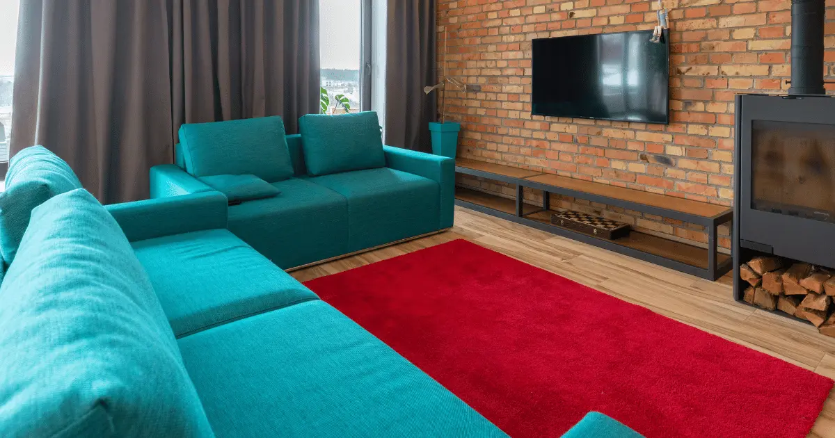
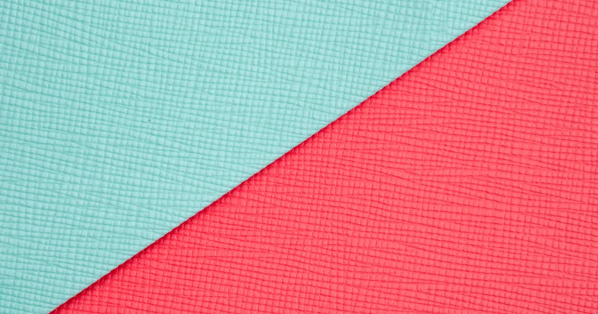
6. Vivid Red, White, and Turquoise

The blue-green hue, turquoise, is also known as Persian blue. Consider the color scheme of red and turquoise, ideal for those who want to embrace their bold side. When combined, these two loud hues somehow balance one another out. Using a vibrant red color scheme with turquoise accents can help your bathroom feel and appear like a modern beach house.
Add huge mirrors with light wood trim to brighten the space and bring color to the plain white shiplap walls. Light fixtures, drawer knobs, and faucets should all have chrome finishes to maintain the style. Pair a spotless white summer dress with turquoise jewelry, a red sequin clutch, and red wedges for the perfect summer look.
7. Red and Blue
The color blue has a well-known favorable effect on the human psyche. You feel at ease around blue because it is a color that is symbolic of patience and understanding. You are advised to relax with the color blue while experiencing intense emotions. Its affinity for the ocean is another factor highlighting how calming it is.
You can layer a powder blue leather jacket over a muted red dress or a blue chambray blazer for formal meetings. Add a crimson hat as the last touch for something more casual. Red may be an extremely powerful hue; depending on its tint, some of its tones may require pairing with softer hues.
8. Red and Yellow
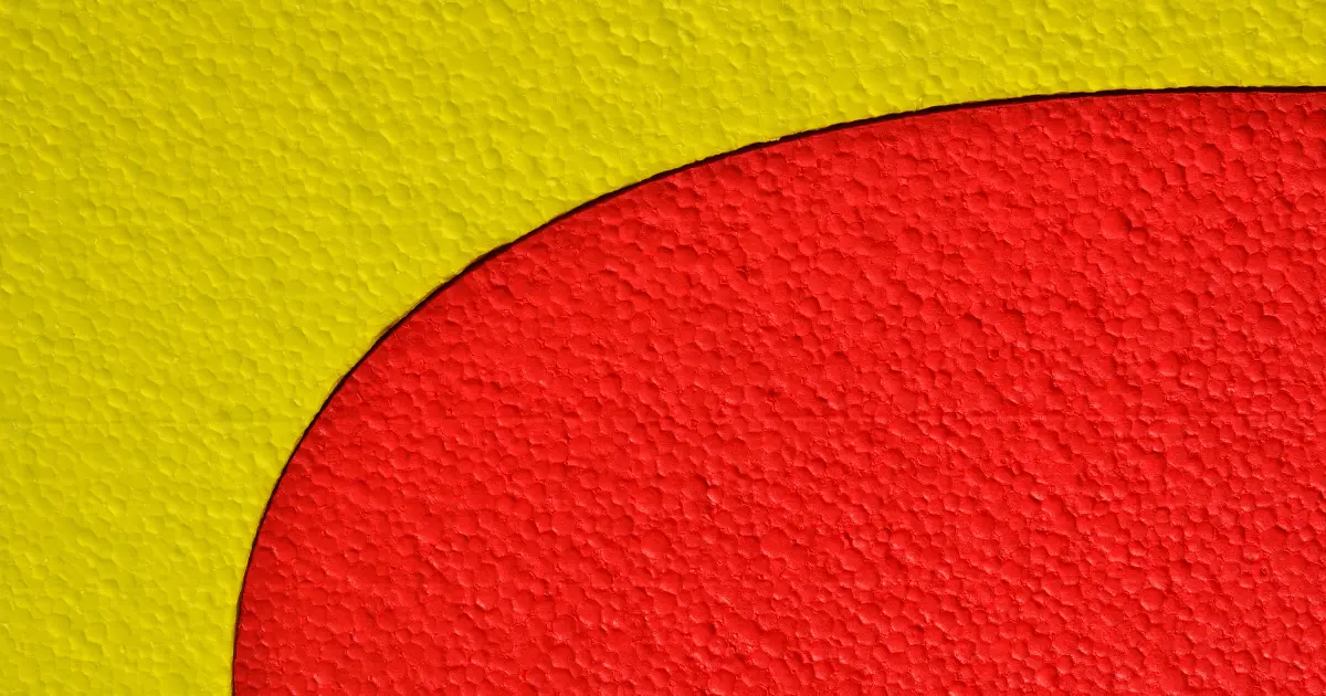
Red and yellow are both primary colors. You might have yet to think about pairing red with this color at first. However, if you do it cautiously, you can rock it. Yellow is the color of sunshine and represents freshness and hope.
With a red ensemble, you can start with little accents like a yellow handbag, pair of shoes, or accessories. Alternatively, put a red jacket over a yellow tank top or the other way around. Red and yellow work well together when their color saturation values are the same.
If yellow (or Red) is not your “colour,” try wearing it as an accessory, such as a shoe, belt, or piece of jewelry that is not right up to your face. Before dismissing red and yellow, consider how you might use this cozy combination.
It would help if you used a rich neutral that can handle both of these strong hues to balance out the reds and yellows because they are on parallel sides of the color wheel. Enjoy this pairing and select strong graphic prints for accent pillows, furniture, wallpaper, and other decors to highlight this cozy pair.
9. Red and Blush Pink

The color pink is a worldwide sign of affection for oneself and others. It has a light red hue and could seem like an odd blend of colors. However, as Red is considered the male counterbalance to pink’s softness and lends a sense of sharpness and vigor to any room, they complement one another.
Red can be paired with some of the color spectrum’s closest neighbors, including candy pink, peach, hot pink, and rouge. Choose a red bottom and experiment with the top if it’s a two-piece costume. However, a little bit of black and white is still necessary.
A pink and red area needs this component to prevent it from seeming like the proverbial box of chocolates because it is the most graphic color combination.
Pink and red décor frequently gives the impression that you reside inside a Valentine’s Day card. Swap out the bubblegum pink for a soft blush or millennial pink to give this color scheme a cool, contemporary edge. The blush is a neutral backdrop for your home, allowing the red sectional to take center stage.
The pair blends well with various colors, not simply neutrals. Our favorite accent colors are browns, cinnamon, orange, claret, pastel blue, grey, daffodil, and violet. This cheerful color scheme can be used throughout your house to create a cheery, energetic space for cooking, working, entertaining, and relaxing.
10. Red and Orange
Red and yellow combine to create orange. You’ll note that most food businesses, including Burger King and Dunkin’ Donuts, use it as the primary color in their advertisements. It demonstrates creativity and enjoyment and piques appetite for no reason other than that.
A vivid, warm hue like Red is one of the simplest to mix with orange. When red is paired with hues close in the color spectrum, like orange, it truly glows.
Combine red with various tones of orange and a few neutral accents for a stylish, contemporary look. Your home will feel warm and inviting with its rich orange cabinetry, pinkish-peach walls, and splashes of grey and blue. An orange throw pillow further complements the warm tone of the wood floors and a red-patterned rug.
This business-casual attire is perfect for exuding boss-woman vibes. Wear a red pair of high-waisted slacks with a belt, an orange off-shoulder knit shirt, orange heels, and a black bag.
11. Red, White, and Silver

Silver is a flat hue with a sleek, metallic sheen and is frequently related to grey. The best technique to generate a silver tone is to blend black and white to create various degrees of grey. It will produce a silver gradient when you blend many greys and add a last dash of white. White and silver produce a stunning signature with red because silver makes the red shine and glitter.
For chic and classy outfit inspiration, match your short white dress with killer silver stiletto heels, silver jewelry, and bold red lipstick for a night out, a fun picnic, or brunch with the girls. When decorating your home, it’s easy to add bold red elements to your home design to liven up a space with chilly tones.
12. Mustard, Gold, and Muted Red
Mustard is a dull or dark yellow color that resembles culinary mustard, whereas gold is a light olive-brown to dark yellow or a moderate, strong to vivid yellow color. Mustard and gold are similar colors, and when added to Red, they form a modern, unexpected twist.
Try a mustard and red floral print midi sundress with red shoes and gold jewelry if you’re looking for a stylish ensemble to wear for a day at the beach. Pick the color that will stand out more—red or mustard—for your bag. It will give you the ideal spring and summer look.
It’s crucial to remember that a spectacular piece of jewelry could draw attention away from your floral dress and contrast it with its bright colors. Simple drop earrings or studs, a thin gold chain with a tiny, delicate pendant or locket, and a lightweight bracelet are preferable. Less is more. Keep your jewelry straightforward, a little conventional, and timeless.
13. Red and Beige
Beige is light brown that is interchangeable with tan, light khaki, taupe, nude, and stone. Add some beige to the mix if you want to tame Red’s fiery quality. Warm neutrals help bring some balance to the strong hue, red. Beige, indeed has a terrible reputation for being dull on its own. But it can provide just the right amount of contrast when used with Red.
Additionally, it is calming rather than a clean, brilliant white. For instance, the soft texture of a large map completes the appearance of red walls in your bedroom and all but whisks you away to the French countryside.
Try something different and let go of a little bit of the traditional formal attire. Red ankle-length slacks and a soft tan pullover make for a sophisticated yet subtle combination. This outfit would look wonderful with a pair of kitten heels and a small bun.
14. Red, Brown, and Black

Black and brown are neutral hues. They significantly affect interior design, painting, decoration, and other fields when appropriately picked. They give depth to red, make it the center of attention, and seamlessly fade into the background. Red, on the other hand, keeps brown and black from appearing too dull.
Consider current architectural features and decor before deciding on a color palette. Dark shades of red and black, from the sofa to the armchairs, can be incorporated into your home décor to give it a cozy, stylish vibe that can withstand a fireplace with a striking pattern and dramatic brown wood ceiling beams and flooring.
15. Red and Aquamarine
Aquamarine is another striking color that goes well with Red. Its cool-toned, stylish appearance makes it ideal for modern living rooms and offices. Coral and raspberry reds go exceptionally well with aquamarine. But when paired with main reds, it also makes a striking contrast similar to turquoise.
One thing about aqua and Red is that they make a cheerful and vivid color combination. For your home decor, use pale aqua and brown colors to provide the foundation of a warm family living room, making it a great place to meet, unwind, and enjoy.
Throw in red accents on the curtain panels, side table, and a few accessories to lighten the area and convey a welcoming atmosphere. Let the height of the folding screen and curtains be close, putting both colors on an equal visual footing despite one being more dominating.
16. Cobalt and Red

Any tint of blue appears spectacular when combined with Red. Additionally, the energy produced can vary greatly based on the combined red and blue colors. Add cobalt accents to muted clay red for a balance of vibrant and muted vitality.
Cobalt can also be paired with similarly vivid crimson. This combination is a decorative element for a space, like a patterned rug. A red accent wall can also make a statement if you can find cobalt-blue chairs or a cobalt table runner. In the end, red and cobalt are both timeless and functional colors, so it’s worthwhile to experiment with shades of both before settling on one.
17. Teal and Red
Despite being a richer shade than turquoise, teal complements red in the design. In a generally neutral color palette, a tapestry with a pattern of teal and crimson makes a striking statement. This shade complements red furnishings just like many others on the list do.
A wall with a design in teal and white provides a welcome break from the sometimes-heavy teal and Red. Use teal and Red as subtly accent colors if you’d rather use only a few extremely vibrant hues. These tiny touches can provide just the right amount of vitality in a largely white or grey room.
18. Red and Air force blue

Oxblood or a clay red tint goes beautifully with Air Force blue, and it is relatively subdued and lies between navy blue and charcoal grey. However, whereas navy blue frequently gives a space a nautical or Americana vibe, the chilly undertones of Air Force blue offer any space a contemporary edge.
The bedroom is a cool enough place to employ this color, and it looks particularly nice in a space with a red bedspread. You can reverse the color scheme if you want to create a room with a lot of energy: red walls look excellent with Air Force blue bedspreads and furnishings.
Include white, beige, or another neutral color in any design incorporating red or Air Force blue because both colors can be quite powerful.
19. Cyan and Red
If you’re familiar with the various codes used to identify colors, you probably recognize this as the first letter in CMYK. It’s a relatively light, bright blue that’s decidedly different from sky blue. It might surprise you to learn that cyan and Red go well together.
In particular, the 1950s are recalled through cyan and a vivid cherry red. Making blue the dominant color in the space is one of the finest methods to achieve this. Add some understated red decorations next, such as wall clocks, picture frames, and bowls, among other items.
20. Prints and Red
By decorating it with prints, you may give the already elegant red a little personality. Avoid stripes and over-the-top florals, and choose an animal print instead. Combine red sweaters or turtleneck T-shirts with animal print culottes, slacks, or skirts for a super-cute look.
Conclusion
Red is a powerful color, making a bold and dominant statement as an outfit or home decor. It is very versatile and works well with other colors. With this article, you can explore and splurge on Red. Be it in home decor or as a wardrobe essential.