Who doesn’t love colors? Everything you see around you possesses color or colors. From the blue sky to the vegetation with different shades of green to the brown cockroach and white horse found, everything you can find in nature. They’re such beauty to behold.
Colors are powerful, speaking volumes, and they are means of communicating consciously and unconsciously. Colors represent places, people, objects, and memories, enhancing or dampening the mood. In this article, we will learn about two colors from the Red family- Maroon and Burgundy.
Maroon vs Burgundy – History
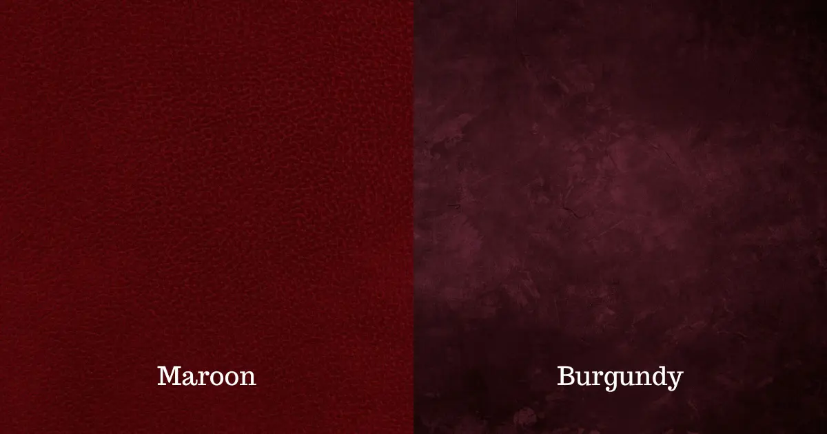
Interestingly, both colors originate from France. Maroon is a word used to describe a dark red color. Although the word maroon has been used since the 16th century, it officially became associated with the color in 1789.
It originates from the French word Marron, which means ‘chestnut’ because chestnuts brag a dark red color, leading many to relate this word to this group of deciduous shrubs and trees. There are different shades of maroon: burnt maroon, maroon oak, bright maroon, royal maroon, crimson maroon, maroon pink rose vale, and much more are related to this color.
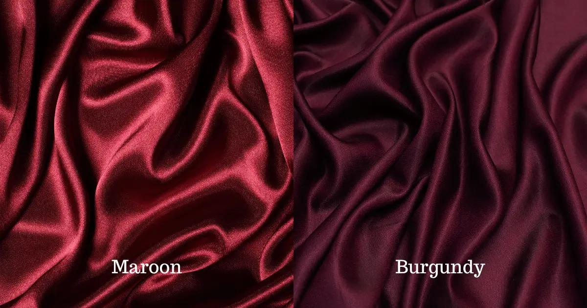
Burgundy is lighter than maroon and is a deep, dark red, purplish color, named after the distinctive red wines from the Burgundy vineyards in France. Astonishingly, in France, the color is referred to as ‘Bordeaux ‘about another wine region producing a similar deep red wine color.
There are two available shades of burgundy asides from other variants: vivid and old burgundy. The first was coined after a dye took the name and became popular. This type of burgundy is brighter than traditional burgundy. The prevalent is the old version, darker and more purple in hue, and came into use in the mid-1920s.
Maroon Vs Burgundy: Mode of Creation

Maroon is derived from the combination of red, blue, and yellow. Mixing the primary colors, red, yellow, and blue, in a specific ratio will give the desired Maroon color. The First thing to do is to combine red and blue in a ratio of 5:1. You must mix five parts red and one part blue because red is the dominant color in Maroon.
Next is to mix the color yellow with the previous combination. The color yellow will give it a brownish tone, which is superb for creating the maroon.
Burgundy is a mix of brown and red that has a purple tint. The Purple overtone of burgundy is made by combining blue and red. If you want a bright burgundy, you can achieve this by adding more red. Mixing two portions of red and one portion of green color can also give you burgundy.
Combining orange and blue or green and red helps formulate an improved brown base for burgundy color compared to the combination of purple and yellow.
Maroon VS Burgundy: Combination With Other Colors

Since we have learned how these colors are derived, we should have an idea of how these colors can be combined with other colors by now.
According to the color wheel, teal is the complementary shade for Maroon. Maroon can be beautifully paired with dusty pinks, soft browns, cool grays, and nude colors. Neutral colors like white will also go pretty well.
For maroon paints, the earlier mentioned colors will also be a good match. Maroon and blue go perfectly as maroon; the darker color gives an amazing combination with a light shade of blue. White and maroon shows class as purple, beige, and black form a cool pair.
Maroon is well-complimented with yellow, green, red, and off-white. Note that light colors are the best color combinations with Maroon.
Burgundy is well complemented with shades of grey, such as light or charcoal grey. It can also be beautifully complimented with colors like golden yellow, navy blue, turquoise, teal, forest, sage green, mint, or dusty pink, and other neutrals like black, white, and beige. Peach is also a perfect compliment as this light color brightens up the otherwise darkened burgundy.
Maroon Vs. Burgundy: Color Psychology

It is interesting to note that Maroon and Burgundy colors have similar features in terms of meaning. The Maroon color signifies luxury, ambition, elegance, confidence, sophistication, determination, beauty, strength, excitement, power, and warmth.
Maroon is an incredibly intense color at its height, and it savors and appreciates the satisfaction of having such an optimistic view of life. Liking the color maroon could tell us a lot about a person. They must be willful and have a distinct presence wherever they go.
The person wearing maroon-colored clothes or accessories means they are proud of your visuals. They want attention and want to present their unique self. Maroon as an aura color implies blockage or stagnation in the energy flow and signifies the need for strength and emotional healing.
Sophistication is a keyword used to describe burgundy. The burgundy is mostly associated with a higher-class society, signifying power, high ambition, and wealth. It reflects intense passion, zeal, strength, determination, and grounded. It is perceived as more intense than other shades of red and lacks the same sense of lightness and fun as shades such as pink.
Therefore, persons who are attempting to display their power or wealthy class may use burgundy as a way to show these features. It is a deep color that depicts pride in one’s appearance.
Consequently, it is safe to say that maroon or burgundy lovers highly value their personality and uniqueness. They love luxury goods, although they can sometimes be a little materialistic. They’re introverted and reserved people. They like to be seen as persons of wealth, sophistication, and high social class. Generally, they are concerned about how others see and judge them.
Maroon Vs. Burgundy: Negative Traits
The negative traits found in the maroon personality type are moody, unpredictable, inconsistent, arrogant, opinionated, selfish, fickle, and flighty. The first step to overcoming these shortcomings is acknowledging them! Maroon brings some strong characteristics with knowledge and work, and a well-balanced life and mindset can be created.
Burgundy also had some degree of negativity associated with it. People who love this color can also be materialistic and easily swayed by wealth and power.
Maroon Vs Burgundy: Color Application
In branding and marketing, the maroon color meaning can differ depending on the individual experience and its significance in the country’s culture. Learning how using maroon for your business affects your audience is important, and it can persuade and encourage people to take risks that can lead to great rewards.
Maroon is known to stimulate appetite making it a common color choice for designing restaurants. Maroon has been related to survival, which may encourage people to pay attention to their physical welfare and safety.
On the other hand, burgundy is a color associated with elegance, professionalism, grandeur, and power. For these reasons, Law firms and nice restaurants often use burgundy.
Maroon Vs. Burgundy: Other applications
In Western cultures, wine’s color is associated with high status, wealth, and luxury. It is easy to see that burgundy is a traditional show-stopper (red) and a pretty blend of purple (purple). Burgundy has a lighter personality than purple or red, so it’s a milder mix.
Burgundy has been a popular color for lipstick since the latter part of the 1990s, and it was especially used by people associated with the ‘goth’ subculture. The color also has been popular for pillow covers and bed sheets made in the same color.
Burgundy can be related to different spiritual meanings. This can mean a feast or a celebration, and it can also be associated with the Blood of Jesus. Drinking wine during a formal Christian Mass symbolizes drinking the blood of Christ.
Are you looking for a wedding color combo that will make a statement? Consider maroon. Maroon is a daring yet elegant color that can be paired with any other color to create a special look. Burgundy is also a popular color for weddings. This berry-shade wine-inspired jewel tone is ideal for any winter color scheme and can also go well with a bold spring and summer palette.
Burgundy can be infused into almost any part of your wedding, from the burgundy cake to the wedding invitations, groomsmen and bridesmaid dresses, table covers, table centerpieces, and so on, making your guests wowed for this unique event.
Burgundy is perfect to combine with gold, and adding golden color like an accent gives it a sophisticated bright mood. And remember the accessories, invitations, paper goods, and wedding favors.
Burgundy can be difficult to style. But if you choose the right shade of burgundy paired with the right accessories, you can wear a burgundy dress to a summer wedding. Here are some tips that can help you style a burgundy dress for a summer wedding:
• Select a lighter shade of burgundy, like rose gold or a blush burgundy.
• Pair the dress with nude or light-colored shoes and accessories.
• Add a pop of color to your shoes or accessories to add a touch of playfulness to your look.
• Let your makeup be natural to balance the boldness of the burgundy dress. With these few in mind, you can rock a burgundy dress at a summer wedding!
Final Thoughts
In closing, the main difference between Maroon and Burgundy is that maroon is made by adding brown to red, whereas burgundy is made by adding purple to red. Maroon has the hexadecimal code of #800000, while burgundy has the hexadecimal code of #800020. These colors speak beauty, intensity, class, and power.

