
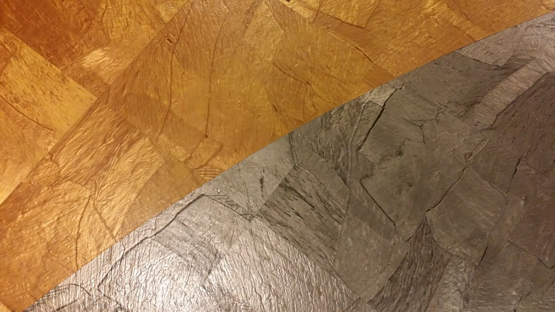
These metallic colors are undoubtedly very similar and difficult to distinguish by sight. Most often, they are used interchangeably and applied wrongly, especially in creating certain color schemes for design.
You might ask yourself, “do I really have to understand the disparity between these two colors?” Absolutely yes. A good mastery and understanding of closely related colors like this will help you take your designs and style to the next level. This article will set you on the journey to being a color professional.
History of Bronze and Copper Color
Bronze
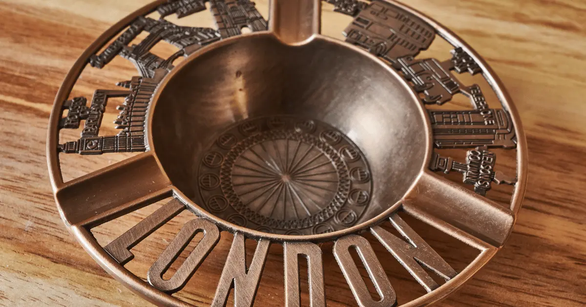
Bronze is a metallic color that was very popular during the archeological period characterized as the bronze age. During this bronze age, our ancestors used the hardest metal to make weapons for war, tools, jewelry, and sculptures.
The word bronze originated from the Latin word bronzium, which means burnt or brown. The word bronze as a color was first used in the year 1753. The application of bronze as a color is vast and dynamic, applicable in art, home decor, and dresses.
Copper
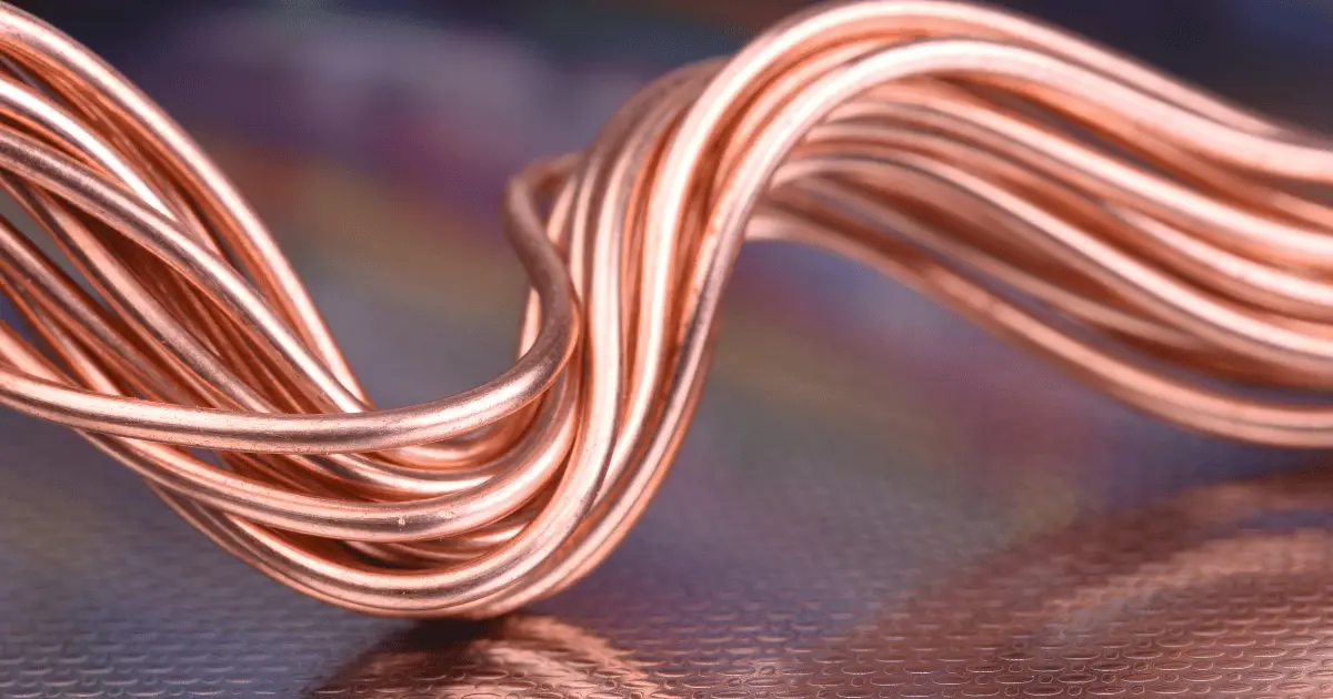
The copper color gets its name from the hue of copper metal, which has been in existence and widely used since 8000-9000 BC. The metal was symbolic due to its association with the goddess of love, Venus. This association was due to the beautiful natural luster of copper plus the application of this metal in the production of mirrors.
An interesting property of naturally occurring copper metal is its antibacterial properties, and the Egyptians harness this properly by treating minor skin diseases and illnesses and sterilization. The application of copper color is unquantifiable, and it gives your designs a vibrant and professional look.
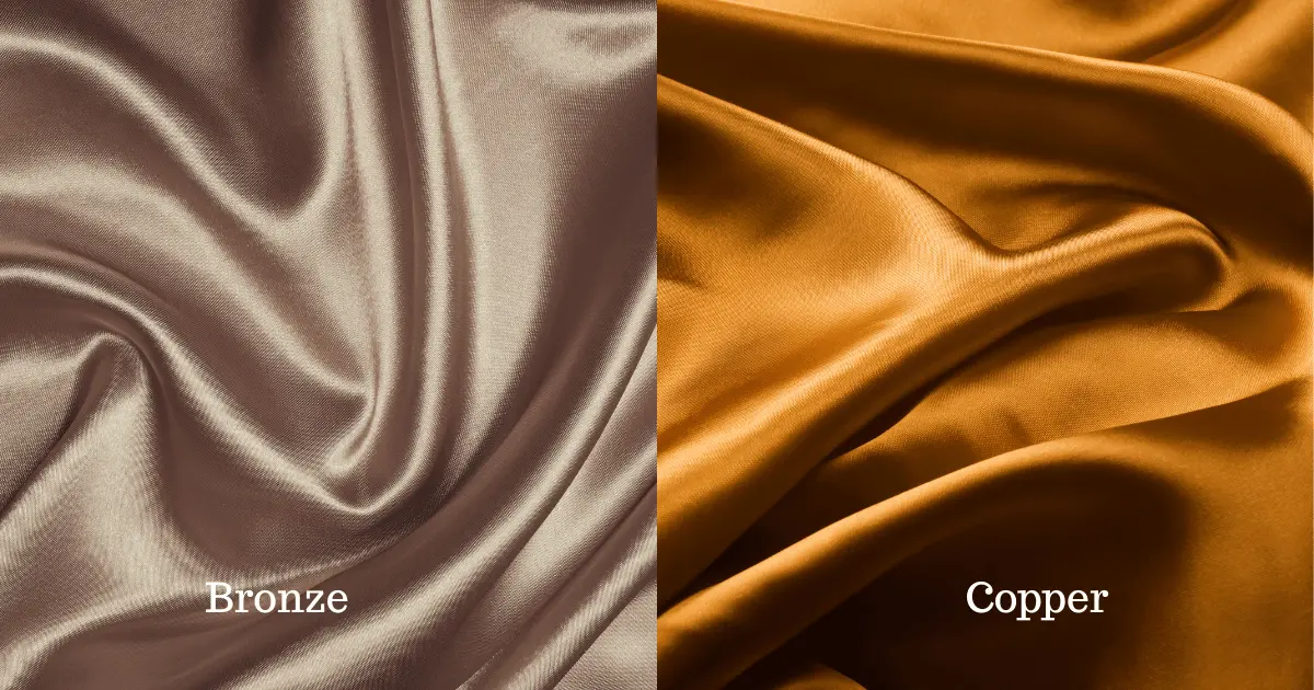
What Color Is Bronze?
Web designers make use of this hex code for bronze; #CD7F32. Bronze is a metallic shade described as a yellowish-brown color.
What Color is Copper?
Web designers make use of this hex code for copper; #BB7333. On the color wheel, copper color lies between red and orange, giving it a reddish-brown appearance.
Bronze vs. Copper: How is it Made?
Creating Bronze
To make bronze using the RGB system, incorporate red, blue, and green. If you wish to use the CMYK system, incorporate yellow, black, magenta, and light blue to make a bronze color with a yellowish-brown hue. Bronze is composed mainly of red which is evident in the color distribution, and it is composed of 80.4% red, 19.6% blue, and 49.8% green.
Creating Copper
To make copper, combine brown and orange colors in equal ratios. You can experiment by mixing more red or orange into the palette, and another option is to mix cadmium red and cadmium yellow or orange.
Which is lighter, Bronze or Copper?
Copper is lighter than bronze. Bronze appears more red than copper with a deeper yellow-brown hue.
Bronze Vs. Copper: Shades
Bronze
There are unique shades related to bronze color: metallic bronze, dark bronze, brilliant bronze, reddish bronze, and earth bronze.
• Metallic Bronze (#B08D57)
It is a lustrous brown composed of 69.02% red, 55.29% green, and 34.12% blue.
• Dark Bronze (#804A00)
This bronze shade is a dark brown composed of 50.2% red, 29% green, and 21% blue.
• Brilliant Bronze
This has a shade of metallic bronze and a shiny hue.• Reddish BronzeThis bronze shade gives off a reddish hue.
• Earth Bronze
This shade of bronze has a close resemblance to compost, and it is the darkest of all bronze shades.
Copper
Copper can be seen to occur naturally. Some plants take on the beautiful shade of copper, and more popular is the copperhead snake. Copper varies from pale copper to reddish copper and deep-colored copper. The most common shades of copper include;
• Copper rose
The first time the copper rose was recognized as a color was in 1928. This color has an enchanting pinkish hue.
• Pale copper
This shade of copper is softer and lighter than the original copper color. Crayola created this non-metallic shade in 1903.
• Copper Red
This is a darker shade of copper with a deep red hue.
Bronze Vs. Copper: Color Psychology
Bronze Color Psychology
Bronze symbolizes strength, natural beauty, and near perfection. People with bronze-like attributes are ambitious and energetic goal-setters. Bronze is selfless and dutiful and loves to see people succeed through it.
This color symbolizes sincerity as it always stands for the truth without thinking twice. It radiates happiness and brightens a dimly lit atmosphere. There is no dull moment with this thrilling color. This color is charming and admired by many for being accommodating and relatable.
Copper Color Psychology
Copper is warm, passionate, and energetic and resonates with the brightest and strongest emotions. The Copper rose is strongly associated with feminity and romance. This color is accommodating, real, bold, and at the same time, extremely cheerful.
Another wonderful trait of copper is its association with money (copper was used to making coins), symbolizing wealth and prosperity. It enjoys luxury and a comfortable lifestyle.
This color is also very artistic and expressive, as seen in artworks, forge, and cookware. Its innovative nature is seen in the industrial setting, where it is used for wiring and water piping.
Bronze vs. Copper: Color Applications
• Graphic Design
You can make the classiest of designs with either of these colors. They are both captivating and can be used for product branding or designing technology and crypto websites.
• Interior Decor
Both bronze and copper work well interchangeably for designing interiors. These metallic shades can support and accentuate bright colors such as blue, pink, and orange; they also work well with grey giving your home a sophisticated look.
Using these colors in your home gives you a sense of luxury and class. You could adopt bronze or copper light fixtures, door handles, and artifacts for your living room.
Final Thoughts
Several colors are closely related to each other and difficult to distinguish; one such is copper and bronze. Knowing their major differences, similarities, and applications will help you make better choices when finding the perfect color for your designs.