
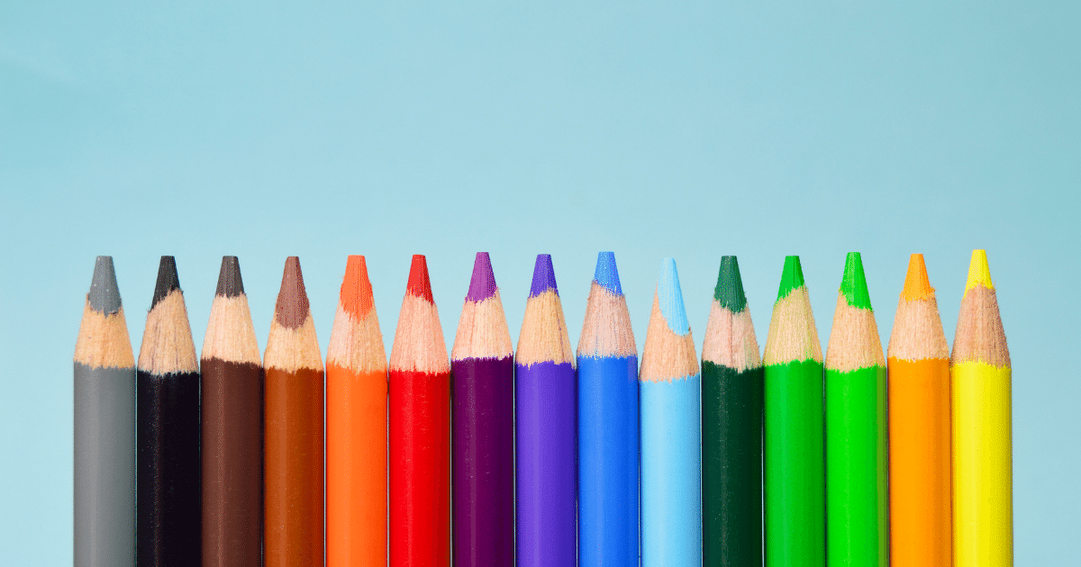
The color wheel is a good place to start when looking for color combinations. Colors opposite each other on the wheel make the best contrast, while colors next to each other on the wheel will make the best pairing.
Colors are the most important part of any design; they can make a design look good or bad. The colors you choose to use in your design should be carefully selected and go well together. I’ll show you some of the color combinations that go well together and which colors don’t.
What Color Combinations Look Good Together?
A color combination is two or more colors used in art, fashion, or other creative work. When choosing colors for a design, it is important to consider which colors will work well together and which won’t.
Orange and blue are popular combinations, as they can be used in many different designs and styles. Green and yellow are another popular pairing because they have a calming effect and work well together in nature.
One of the fundamental parts of good design is color choice. Colors can make or break a design, so it’s important to know what colors go well together and which clash. Here is a line of colors that go well together, so you can choose the right one for your project.
The following chart provides some color combinations that look good together:
1. Red and Green
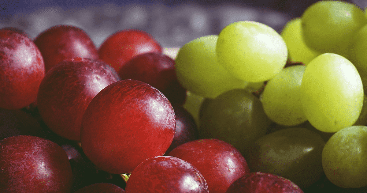
Green and red are traditional color combinations. Many people adore this color combination, and you only need to choose the appropriate color from each and style them together. This outfit is a great illustration of how red and green tones work nicely together.
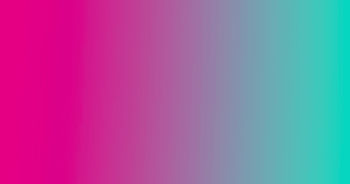
2. Fuchsia and Neon Green
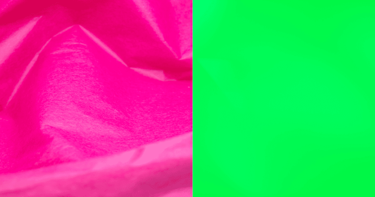
Bright, bold, daring fuchsia and neon green are other high-energy color combinations on the list. Fuchsia and neon green have an upbeat atmosphere similar to hot pink and cyan, making them perfect for fashion or the avant-garde.
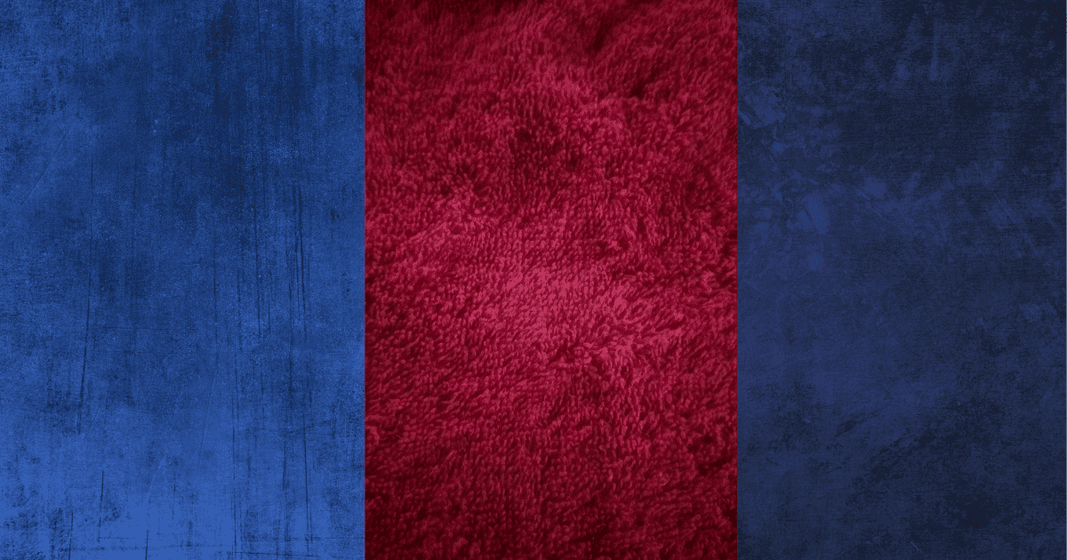
3. Blue and Red
I love how beautifully these two fundamental colors go together and function! Avoid adding too many other colors when combining red and blue since they are both vibrant!
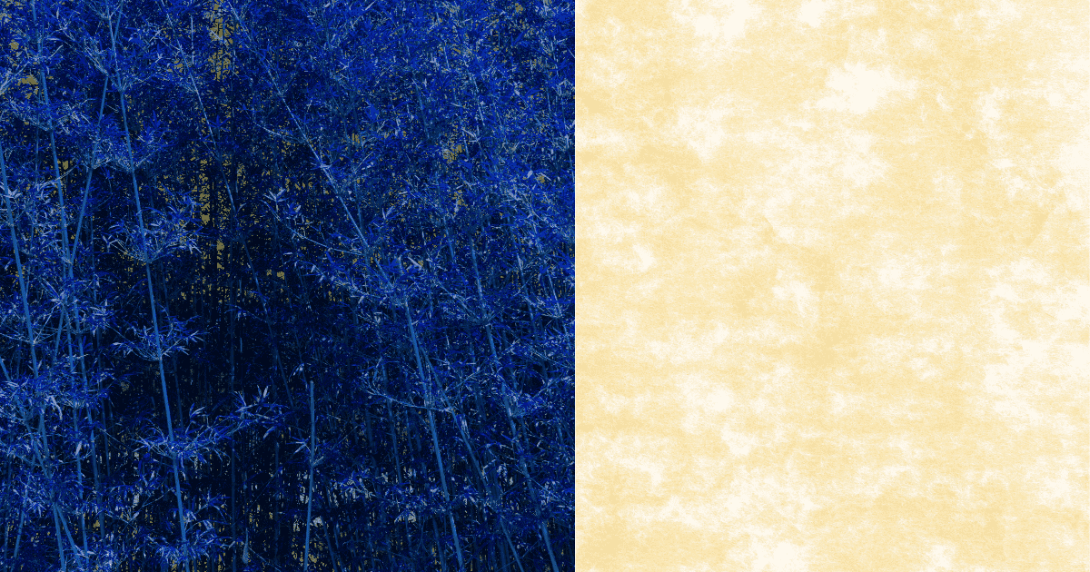
4. Blue and Yellow
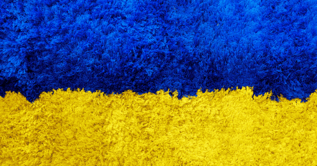
Yellow stands for joy and happiness, whereas dark blue is the color of the night and quiet. Since the two hues oppose one another on the color wheel, this contrast helps produce a lively color combination.
5. Red and Gold
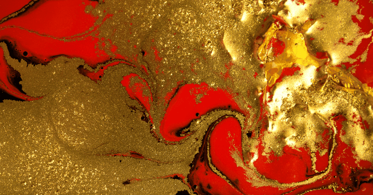
The colors red and gold blend well together in Christmas-themed decor. It is elegant and opulent and is present in high-end goods.
6. Lilac and Purple or Blue
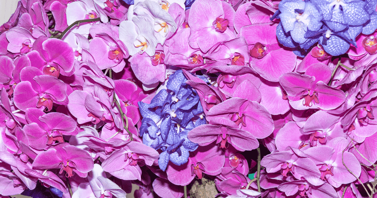
Bright and gentle color combinations usually provide elegant contrast! Natural hues are excellent for fostering a peaceful and joyful atmosphere.
7. Purple and Orange
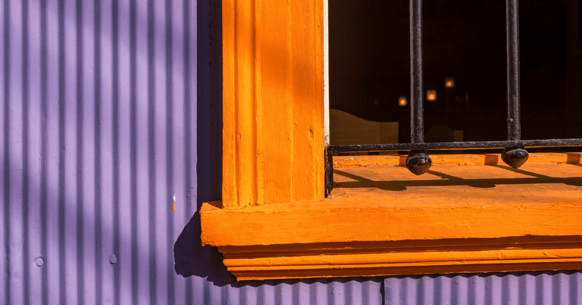
Purple and orange complement each other nicely since they are analogous colors. Deep oranges and purples are ideal for apparel and furnishings.
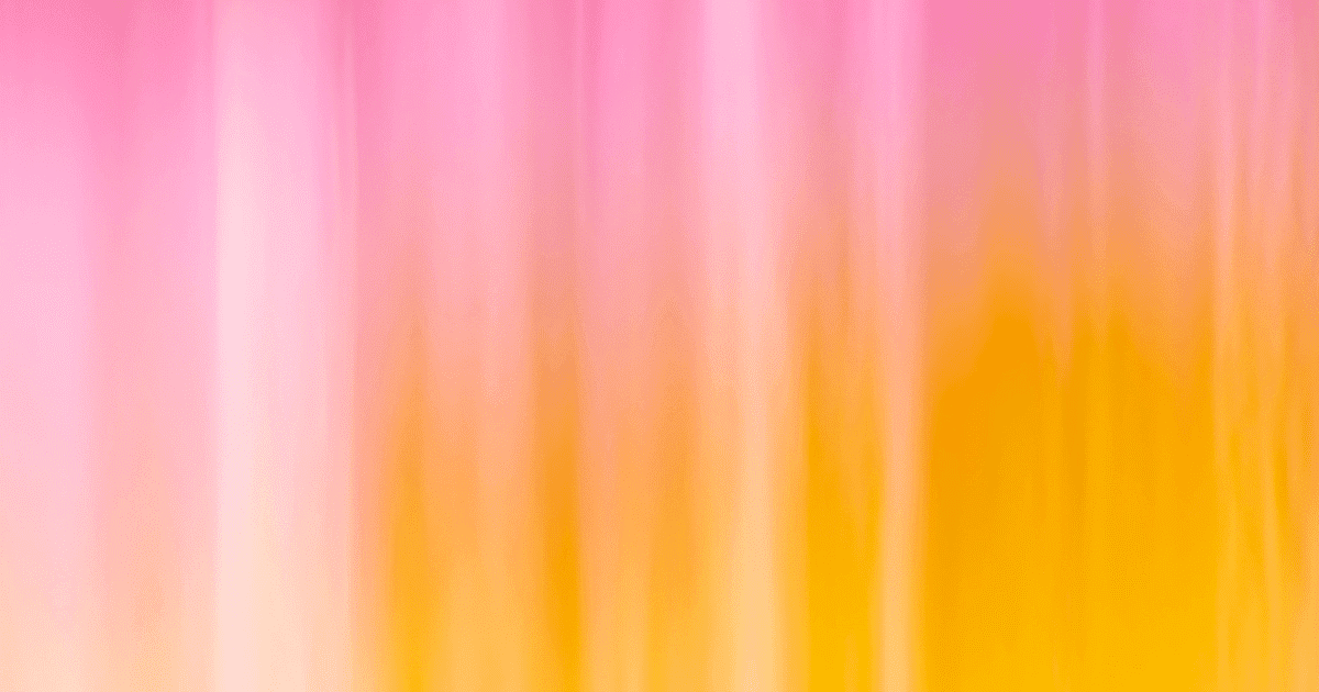
8. Pale Pink and Mustard
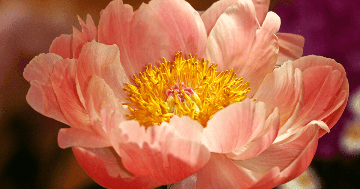
Pale shades of pink and yellow are excellent for children’s art and for displaying femininity. Create delicate, feminine artwork with these color combinations.
9. Green and Yellow
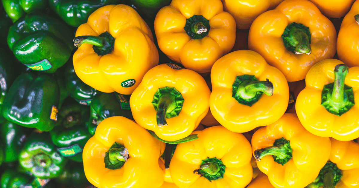
Yellow-green, a tertiary hue, is produced when green and yellow paint is combined, and a yellow-green tertiary hue is produced. Although it resembles a paler shade of green, many people call it chartreuse. Different shades of yellow-green may be produced by adding more green or yellow to this hue.
10. Yellow and Orange
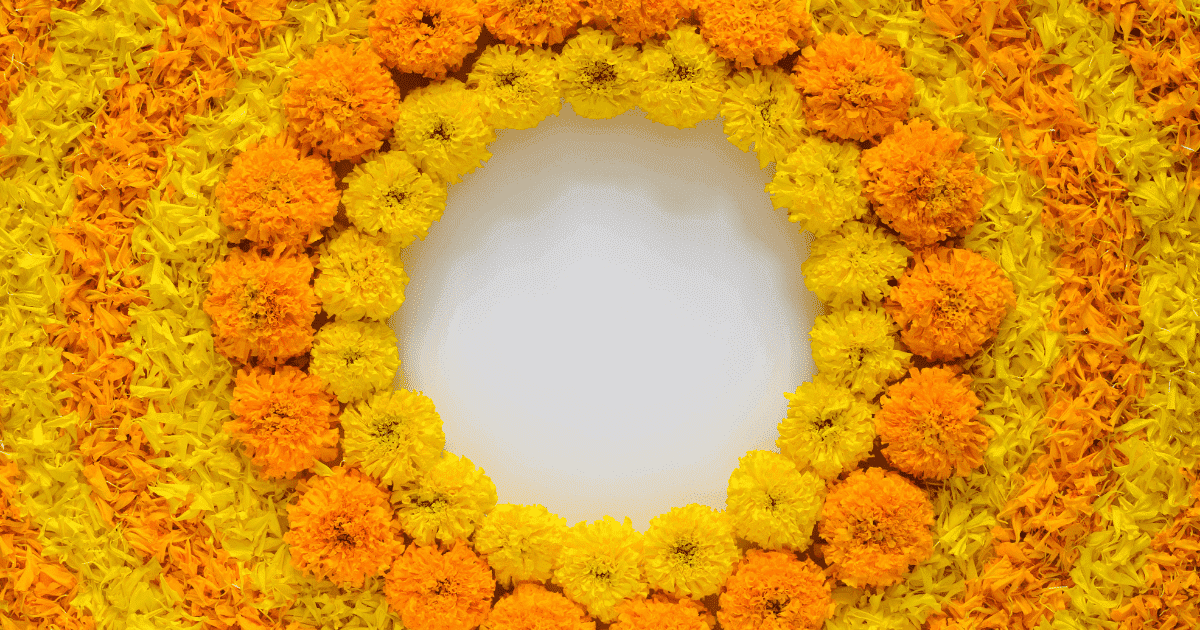
The color orange stands for assurance and achievement. When you add a splash of orange to drab, dark colors, your artwork will stand out right away. These colors are utilized in autumn-themed artwork.
11. Royal blue and Peach
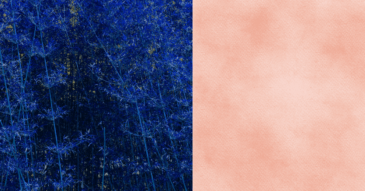
The color palette is stunning since blue is a cold hue and peach is a warmer color, so they complement each other well. The white is an excellent accent that keeps the whole palette looking fresh and lovely.
12. Royal Blue and Pale Yellow
Royal blue and light yellow provide a stunning combination of formal and warm colors. The blend of a rich, dark blue and a cheery, pastel yellow conveys stability, security, and dependability, making them the perfect brand colors.
13. Blue and Pink
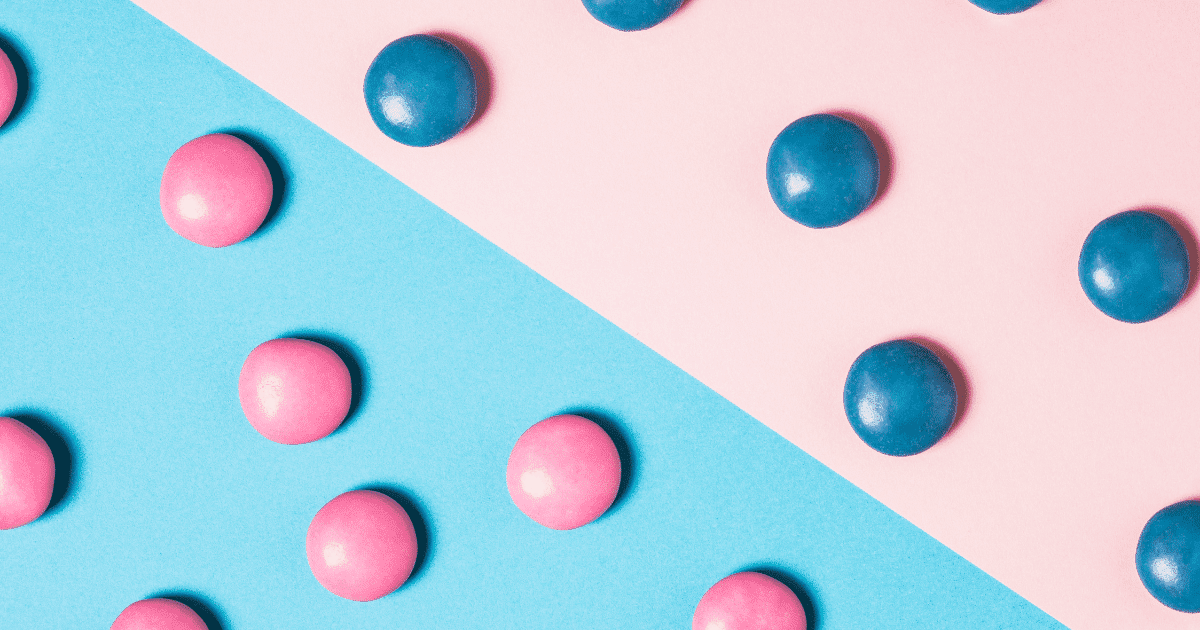
Pink and blue are complementary colors that provide a striking contrast. Because it is found in nature, such as the sea and sky, and is strong and symbolic of knowledge and self-assurance, dark blue fosters a serene atmosphere. Pink is popular in feminine designs and little girls’ artwork because it has a relaxing impact.
14. Charcoal and yellow

Charcoal grey looks most appealing with contrasting hues like white and bright grey. It may also be used as a foreground for bright colors like blue, yellow, or green.
15. Red and Yellow
Two main colors are combined to create a secondary color. For instance, orange results from the combination of red and yellow, and high contrast is used in pairing the red and yellow colors. Colors blend effectively in many ways when there is a lot of contrast between them.
16. Bright Pink and Yellow
The bright pink hue is energizing, has a lot of vigor, and effectively complements the vivid lime yellow. Children’s clothing and home décor designs look fantastic in these vibrant colors. Yellow and pink make a happy combination, and wearing them together is easier than you think. Buttery hues go well with vibrant pinks, while lemony tones appear dreamy when contrasted with rosy pastels.
17. Blue, maroon, and indigo
Another stunning analogous hue mix down the line is blue, maroon, and indigo. These blue hues channel the same calm and dependability of the color blue when mixed with maroon, still with a modern twist thanks to the accession of maroon. Think about using this color arrangement for any tech-related brand or product.
18. Lavender and Teal
The classic color combination for anything visually pleasant is lavender and teal. Because of its calming, earthy character, this sophisticated but fun combination is often used in baby goods sold to parents.
19. Hot Pink and Cyan
Cyan might be a difficult hue to match, but the hot pink and cyan color combination truly works. These vibrant, high-contrast colors evoke a sense of enthusiasm that is excellent for a fresh perspective on more whimsical branding.
20. Light Blue and Dark Blue
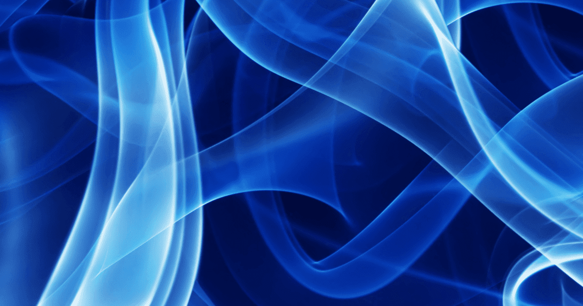
Suppose you wish to keep stuff as simple as ABC. Pair a lighter hue of blue with a darker shade. Avoid using complex designs to generate visualizations; instead, use solid colors. The combination of light and dark blue color design shouldn’t be disregarded, albeit subdued to some. This dull combination promotes professionalism and trust.