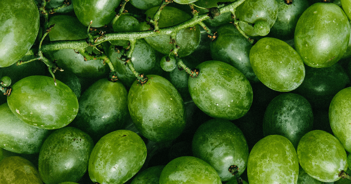
When it comes to green clothing, interiors, and designs, you have a lot to choose from. It is true, especially if you are looking for a great outfit and designs that go with your new tattoo and home decorations.
Every person has their preferences when it comes down to choosing a color scheme. Still, the following will hopefully help you find the best green clothing combinations that suit your style. This article will provide some of the best varieties of green clothing and interior home designs.
What is The Complementary Color Of Green?
Green is a prevalent color in fashion, and finding the right colors for it can be challenging. When looking for a combination of clothing colors or home interiors and seeing greens from top brands such as Under Armour, Nike, and Adidas, it is easy to see why the garden has become so popular. It can be challenging to find the right colors to wear with it.
The following are some of the most common colors that go well with green:
1. Green and black

Black is an excellent color for people who want to wear dark green clothing and not worry about matching it. It also complements light green clothes well.
2. Green and white
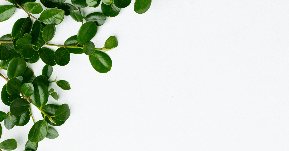
White is another solid option for people who want to wear dark green clothes without worrying about matching them. It also goes well with lighter shades of green, brown, and gold, which are popular in wintertime clothing.
3. Lavender and Green
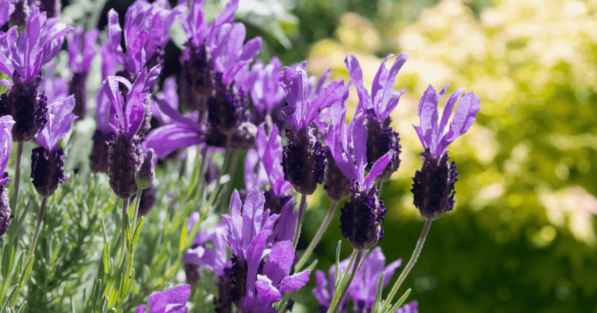
Lavender looks cool with green. When saturated with lavender, it brings out boldness. The paint on the wall could be combined with lavender and green or used in interiors, living rooms, or offices. The bedding and fittings would accommodate the cozy and warm effect it brings.
4. Teal and Green

Symbolizing strength, peace, and calmness is the bluish-green hue. The color is renowned for its sophistication and elegance, making it a fantastic choice for interiors. You are accepting and non-judgmental, and you will consider your options if this is your favorite color.
5. Burnt Sienna, Red, and Green
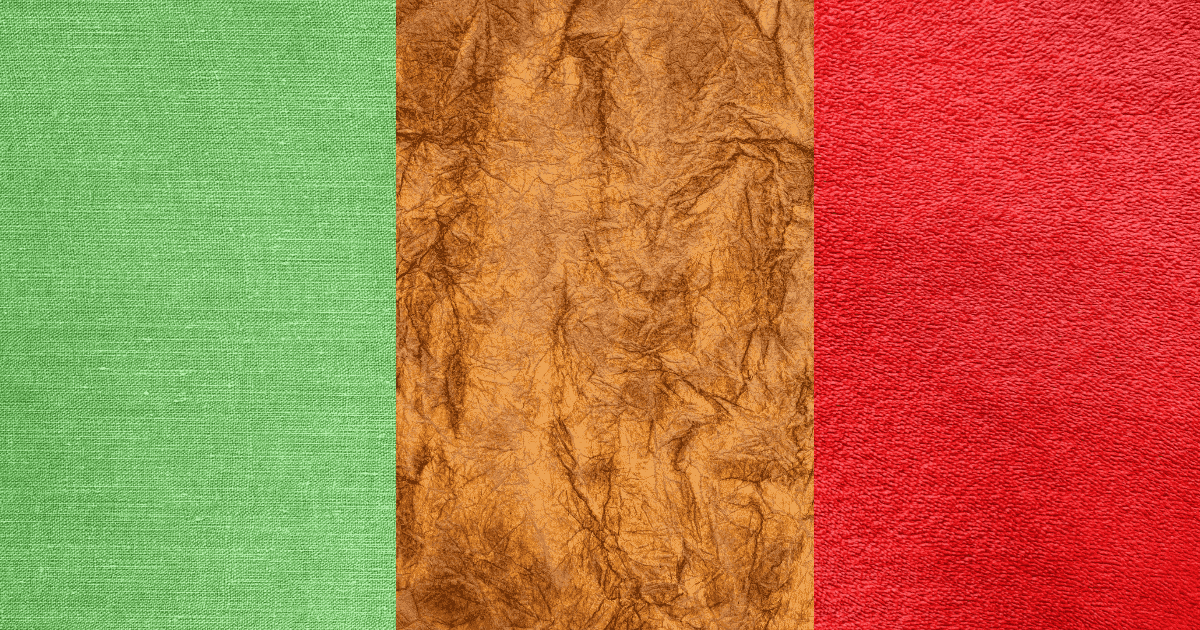
Anhydrous iron oxide makes up a significant percentage of burnt sienna. It is created by heating raw sienna, partially transforming the iron oxide into haematite, and giving it a deep, reddish-brown color. The color is also referred to as red ochre, red earth, and terra rosa—an excellent pigment for a pop-up effect on any interior or wall. Creatively make your fabrics shiny, bright, and loud with this combination.
6. Green and Fuchsia
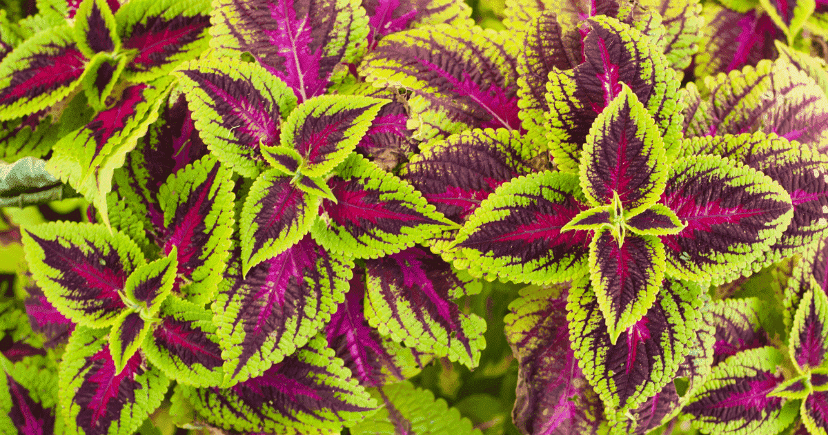
A good color combination is a green and fuchsia. Fuchsia could be upbeat, fun, and joyous. Fuchsia, which comes from the purplish-red blossom, also represents vivacity, assurance, and confidence. Just consider how this vibrant flower shines out in the garden among more somber hues. Painting an office or home apartment with this combination looks good.
7. Green and Burgundy

Make a statement using these colors together. Burgundy is a brown color with purple overtones that results from mixing red with a little bit of green and blue. One could consider burgundy to be a color of authority. Burgundy can be used to demonstrate power or money by those who want to project these qualities.
8. Ochre and Green

The color of light and the sun is ochre. It is a collection of brown, yellow, and red hues created by clay pigments containing ferric oxide, commonly referred to as rust. The bedding and room come alive, blending ochre and green.
9. Green and brown
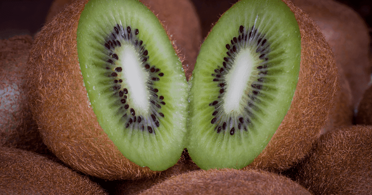
The best way to bring out the beauty of the green color is by matching it with a great color like brown. The brown texture makes the interior cozy, especially in the living room. You may want to combine the wall painting or furniture to create a welcoming atmosphere.
10. Cream and Green
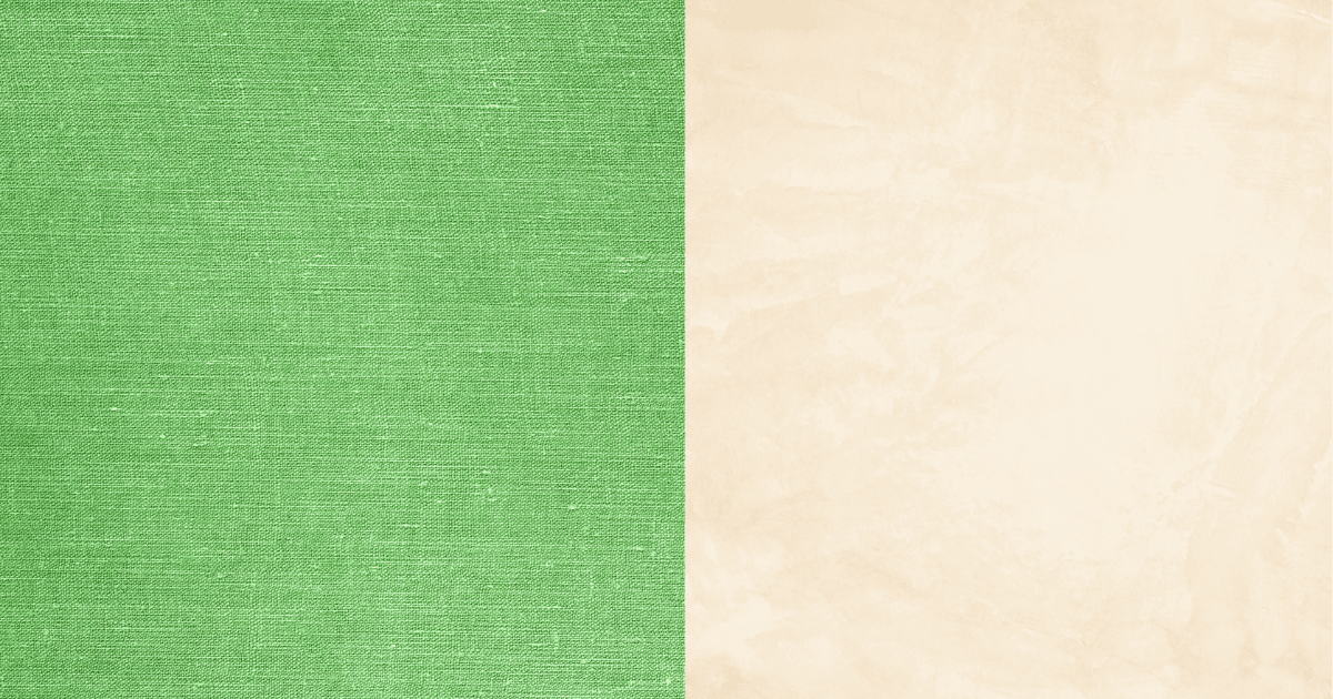
The cream is a symbol of reliability and seriousness. It can stand out boldly when used with vivid reds, greens, or yellows, or it can blend with other neutrals for a modern, rich vibe. Give your interiors the best look with a creamy color.
11. Pink and Green

Pink is one of the hues that is associated with love. We regard the sheer intensity of pink as kind rather than hostile. While green is connected to nature, rebirth, and escape from man’s harsh, gray world, it also represents friendliness.
12. Red and Green
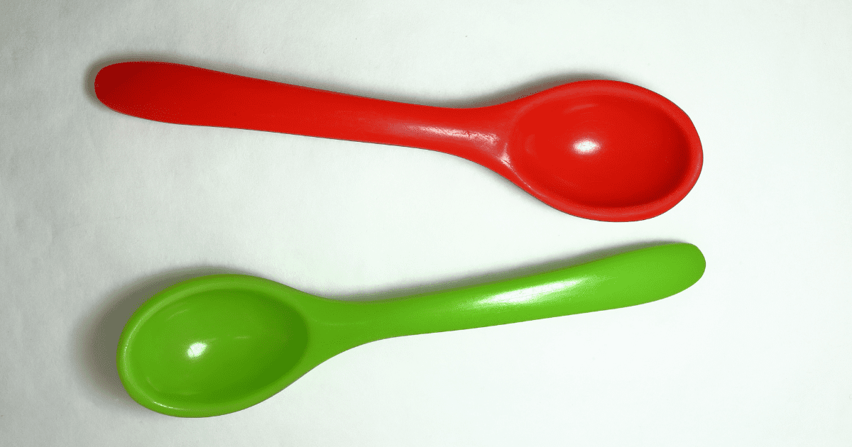
Combined with red and green, like an evergreen tree in the winter, it creates the loudest symbol. Red is linked to vigor, vitality, war, bravery, passion, love, and religious fervor. All of these require passion, and that is their unifying factor.
13. Lilac and Green
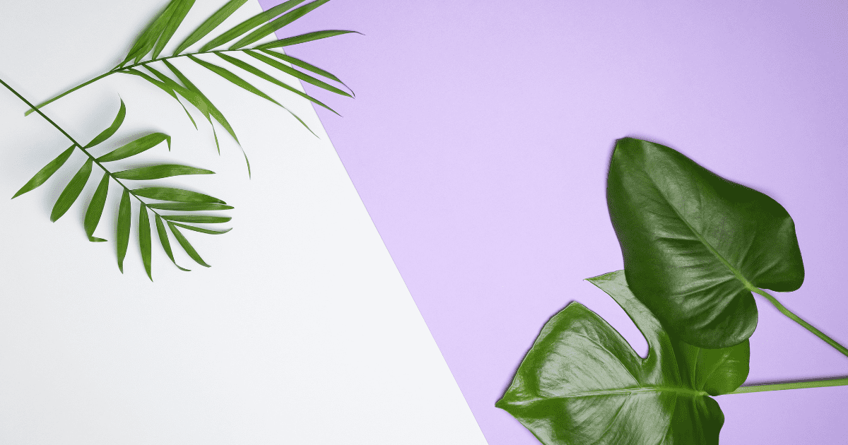
The olive green pairs perfectly with the lilac color. Lilac is a delicate, light shade of violet that stands for innocence, youth, tranquillity, and spirituality.
14. Gray and Green
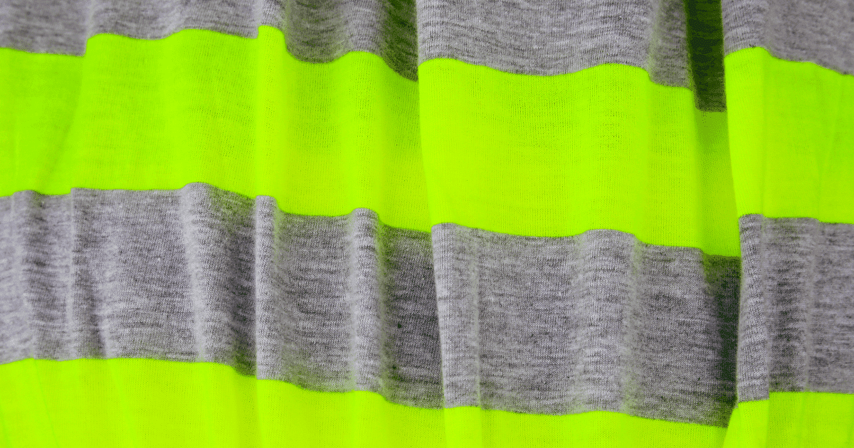
Gray looks murky when combined with green and mixes well. Hope, luck, and charity are some of the positive connotations of the color green. Grey is a color that results from the balance and neutrality of white and black.
15. Orange and Green
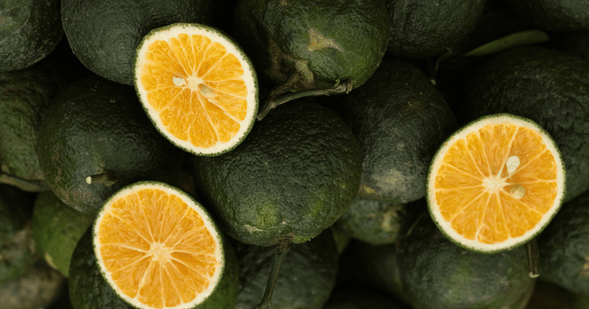
Orange and green go well together since they are complementary hues. Orange relates to vitality, energy, and joy. Green: fresh starts, abundance, the natural world, etc. When used together, these hues produce an exciting and inviting image.
16. Green and Terra Cotta
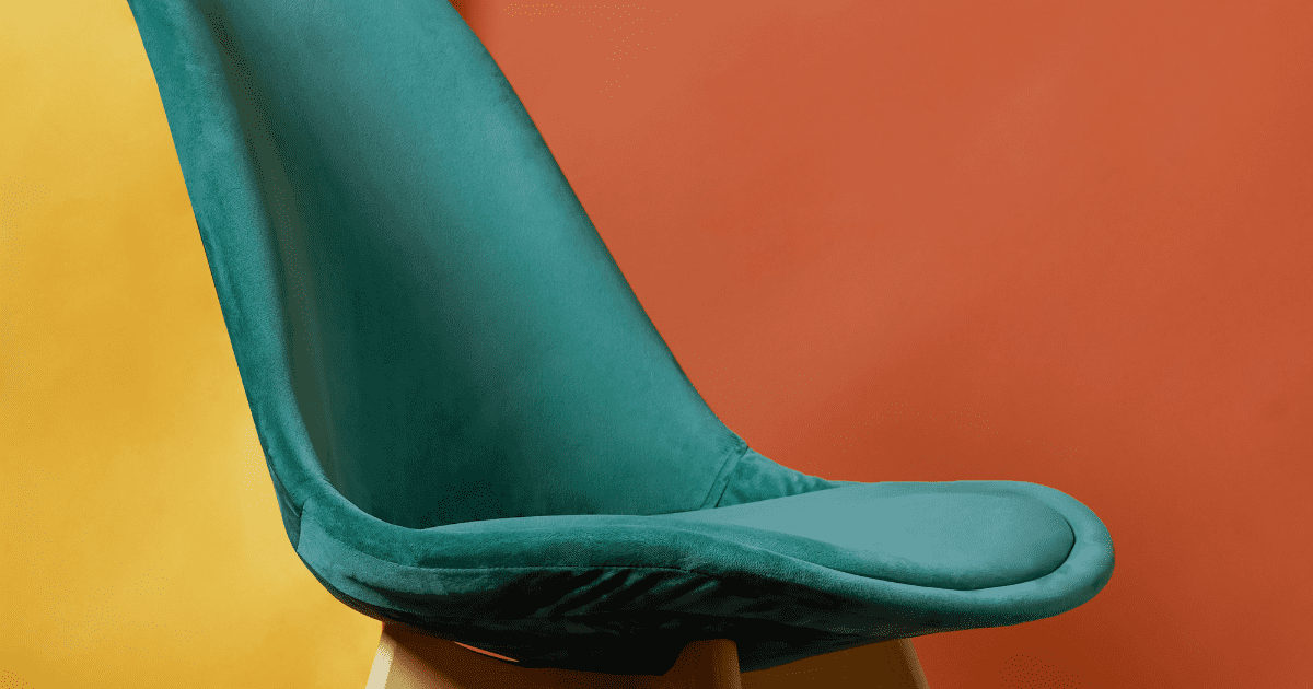
Sky blue, gold, dark green, and white work well with terracotta. It emanates warmth and cheerfulness and is a member of the orange family. It usually brings comfort and joy while also evoking a particular mood and energy. The terracotta’s uplifting hue can also produce strong feelings in people.
17. Yellow and Green

Yellow and green are stimulating, and vibrant colors frequently express joy and vibrancy. Choose a calmer palette by combining Yellow Green with neutral colors, or create a lively and tropical palette by combining Yellow Green with yellow and lime green.
18. Pewter and Green
Gray’s neutrality and solemnity are retained in pewter. Pewter is a light gray with subtle blue undertones that is richly beautiful. If you want a pure pewter color, pewter is the ideal steely gray shade that goes well with many hues, including green.
19. Warm Beige and Green
Given that green and beige are found in nature, they frequently make a solid pairing and a creative color scheme. The rich green walls in the living room are balanced by the beige-framed mirror and cabinet doors, keeping the area from seeming too dark or oppressive.
20. Green and peach

Green and peach go well together. The color might be brilliant and lively or gentle and muted. Peaches with a light, pastel hue are frequently considered sweet, pleasant, and generous. On the other hand, vivid and rich peach hues can represent vitality, enthusiasm, playfulness, and encouragement.

